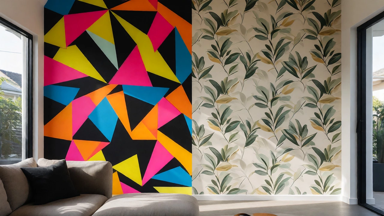
Worried wallpaper will look dated? Discover how to choose timeless designs over fleeting trends. Learn which patterns age well and where to use them safely.
Looking to freshen up a room without a full remodel? You don’t need a design degree or a huge budget. A few smart choices—like where you place furniture, which colors you pick, and how you balance timeless pieces with trends—can make a huge difference. Below are real‑world tips that work in any home.
The 80/20 rule is a simple way to keep things balanced. Spend 80 % of your décor budget on neutral, enduring items—think solid‑color sofas, classic flooring, or simple wall paint. Use the remaining 20 % for bold accessories: a striking rug, a patterned throw, or a piece of art that pops. This mix lets you stay on‑trend without constantly re‑spending.
Another easy win is refrigerator placement. The fridge should sit where it doesn’t block traffic flow or natural light. Avoid putting it in the middle of a kitchen island or right next to the stove. A well‑placed fridge keeps the kitchen feeling open and makes cooking smoother.
When choosing wall décor, think luxury on a budget. Large‑scale art doesn’t have to cost a fortune—look for high‑quality prints, canvas reproductions, or even framed fabric. Pair a bold piece with a simple frame, and you’ve got a focal point that feels upscale.
2024 is the year colour finally gets its say. Forget the endless shades of grey that dominated the last few years. Designers are leaning into vibrant hues—think deep teal, warm terracotta, and energetic mustard. To try it safely, paint an accent wall or add colour through large cushions and curtains. The result is a room that feels lively yet still grounded.
If you love texture, mix materials. A matte wall paired with a glossy metal lamp or a plush rug adds depth without overwhelming the eye. It’s a subtle way to keep the space dynamic.
Thinking about a career in interior decorating? Start by building a portfolio of real projects—even a single room makeover for a friend counts. Show before‑and‑after photos, explain the design choices, and highlight any budget constraints you overcame. This practical evidence tells future clients you can deliver results, not just pretty ideas.
Finally, remember that function follows style. A beautifully styled bathroom loses its charm if the layout makes daily routines a chore. Keep the flow logical: toiletries within arm’s reach, lighting that’s both functional and atmospheric, and storage that hides clutter. When form and function work together, the space feels both stylish and livable.
Ready to try these tips? Pick one—maybe that 80/20 rule—and see how it transforms your room. Small changes add up, and before you know it, you’ll have a space that feels fresh, functional, and truly yours.
Worried wallpaper will look dated? Discover how to choose timeless designs over fleeting trends. Learn which patterns age well and where to use them safely.
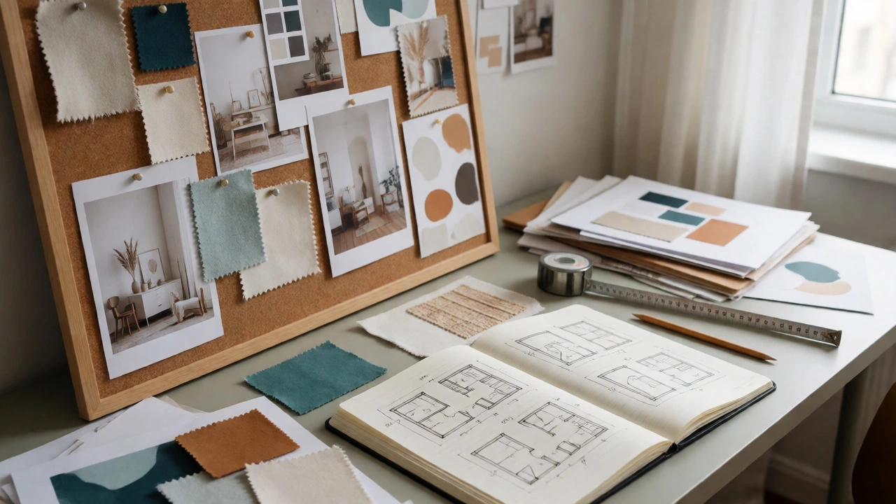
Learn how to start interior design from scratch with our beginner's guide. Master space planning, color palettes, and lighting to transform your home confidently.
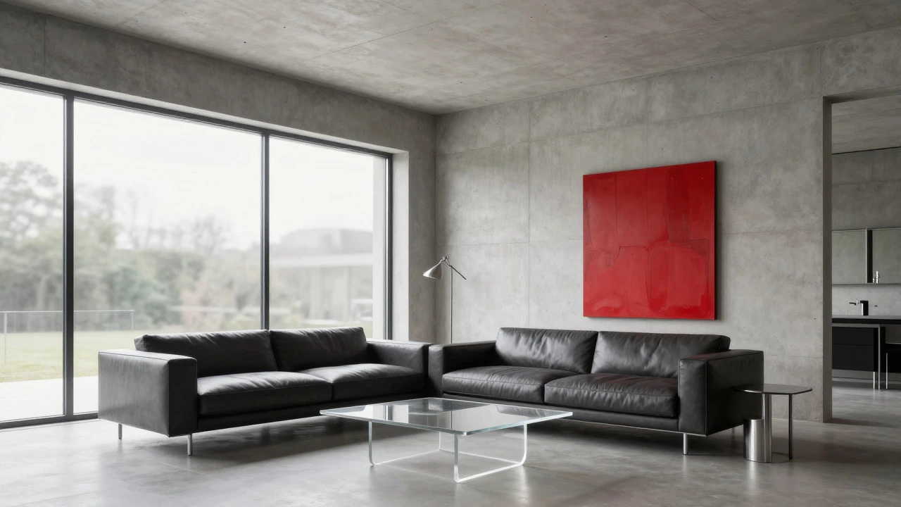
Confused by interior design terms? Learn the key differences between modern and contemporary styles, including materials, colors, and longevity, to choose the right look for your home.
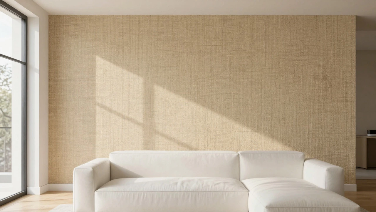
Discover if grass cloth wallpaper is still trendy in 2024. Learn how to style natural textures, choose the right shades, and maintain this organic wall covering for a modern, sustainable home.
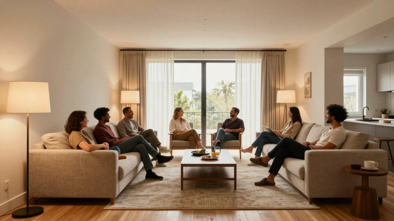
Explore if an interior design career is worth it in 2026. We cover realistic salary ranges, education requirements, work-life balance challenges, and tips to help you decide if this creative path fits your goals.

Discover the 4 essential traits needed to succeed as an interior designer: empathy, technical skill, adaptability, and communication. Learn why creativity alone isn't enough.
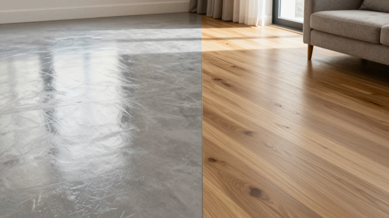
Discover which flooring styles are outdated in 2026, including high-gloss finishes and busy patterns. Learn why warm neutrals and matte textures are the new standard, plus practical tips for choosing timeless, durable flooring for your home.
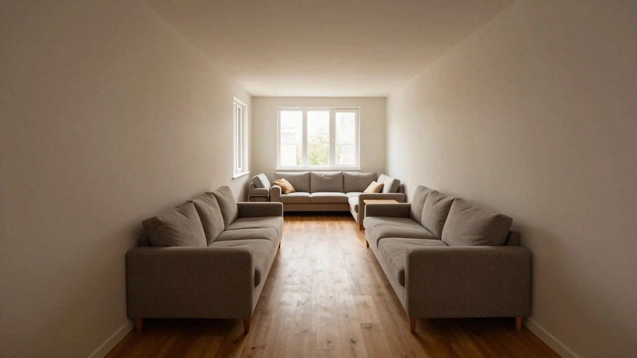
Struggling with an awkward living room layout? Discover practical design hacks to fix odd shapes, improve flow, and maximize space without renovation.
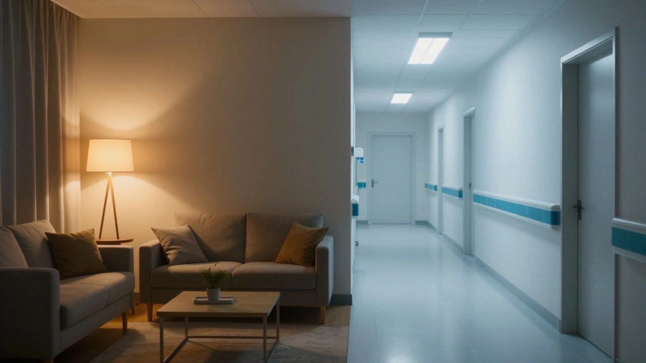
Master home lighting with the foot-candle rule of thumb. Learn how to calculate lumens, choose color temperatures, and layer light for any room.
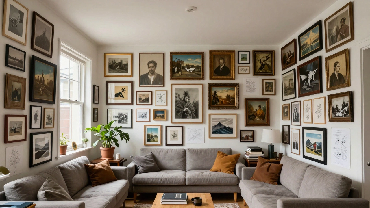
Ever feel like your art is crowding your room? Learn how to balance a gallery wall, distinguish maximalism from clutter, and master art placement.
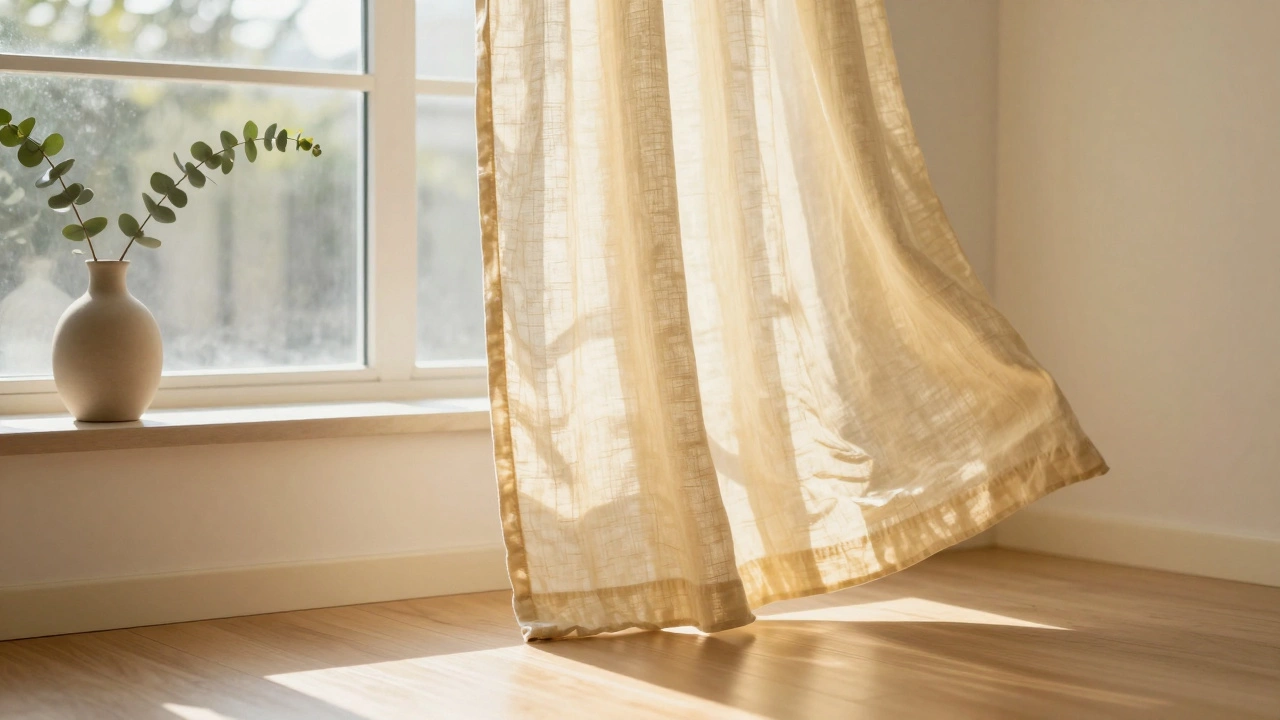
Soft yellow, sky blue, and sage green curtains are the most uplifting colors for your home. They brighten rooms naturally, improve mood, and work well in Auckland’s changing light. Learn why these shades beat bold colors-and how to pick the right one for your space.

Discover the real earnings of interior designers in 2025 - from entry-level pay to six-figure incomes. Learn how top designers make money, common pitfalls, and what it actually takes to build a profitable career.