What Is the 60-30-10 Rule in the Kitchen? A Simple Guide to Balanced Design
Kitchen Color Balance Calculator
The 60-30-10 rule creates balanced kitchen designs: 60% base, 30% secondary, and 10% accent. Enter your color distribution values below to see if they follow the rule.
Color Distribution Calculator
Enter your kitchen's color proportions:
Visual Ratio
Result
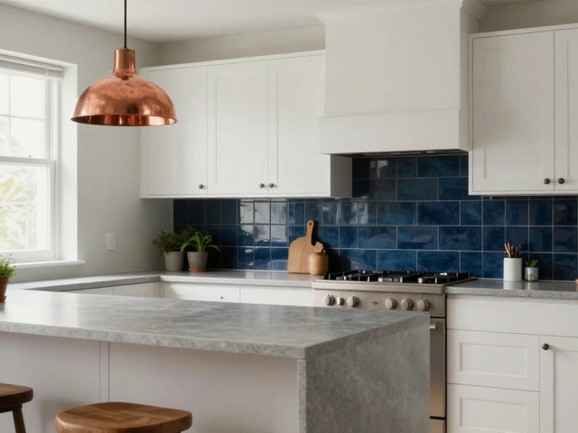
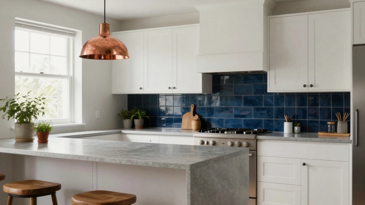
Real Kitchen Examples
60% Base: White cabinets
30% Secondary: Gray quartz countertops
10% Accent: Navy tile backsplash
This creates depth without overwhelming the space.
Ever walked into a kitchen and felt like something was off-even though everything looked clean and modern? You couldn’t put your finger on it, but the space just didn’t feel right. That’s often because the colors, materials, and textures weren’t balanced. Enter the 60-30-10 rule: a simple, proven method used by interior designers to create kitchens that feel cohesive, inviting, and visually satisfying. It’s not magic. It’s math. And it works every time.
What exactly is the 60-30-10 rule?
The 60-30-10 rule is a color distribution formula. It tells you how much of each color to use in a space so it doesn’t feel overwhelming, boring, or chaotic. In a kitchen, that means:
- 60% of the space should be your main color-the foundation.
- 30% should be a secondary color that adds depth and contrast.
- 10% is your accent color-the pop that catches the eye.
This isn’t about painting walls. It’s about how color shows up across surfaces: cabinets, countertops, backsplashes, flooring, appliances, and even small details like towels, rugs, or bar stools.
Why it works in the kitchen
Kitchens are high-traffic zones. They need to be functional, but they also need to feel calming after a long day. Too much of one color-say, all white cabinets and white appliances-and the space feels sterile. Too many competing colors, and it looks like a paint store exploded.
The 60-30-10 rule fixes both problems. The 60% base creates stability. The 30% adds warmth or contrast without dominating. The 10% gives you a moment of joy-a splash of emerald green on a stool, a copper pendant light, or a set of mustard-colored mugs.
Think of it like a song: the 60% is the rhythm section, the 30% is the melody, and the 10% is the solo that makes you pause and smile.
How to apply it step by step
Here’s how to break it down in your own kitchen, whether you’re renovating or just refreshing the look.
- Choose your 60% base. This is your largest surface area: cabinets, flooring, or large wall sections. Most people pick neutral tones-soft whites, warm grays, or earthy beiges. These colors don’t fight with lighting changes throughout the day. If you have dark wood floors, let them carry the 60%. If you’re painting, go for something soft and timeless.
- Pick your 30% secondary. This should complement the base but offer contrast. If your base is warm white, try a charcoal gray or a muted sage green. If your cabinets are dark oak, maybe go with a light stone countertop. This layer adds dimension. It’s what keeps the space from feeling flat.
- Select your 10% accent. This is where personality shines. Use this for things you can change easily: a single cabinet door painted a bold color, a patterned tile backsplash, or even kitchenware. Think rust red, cobalt blue, or metallic brass. The key? Keep it small. One accent wall, one island, one set of stools. Don’t go overboard.
Pro tip: Use the 10% in places where light naturally hits-like under a pendant lamp or on a breakfast nook. That’s where your eye will land first.
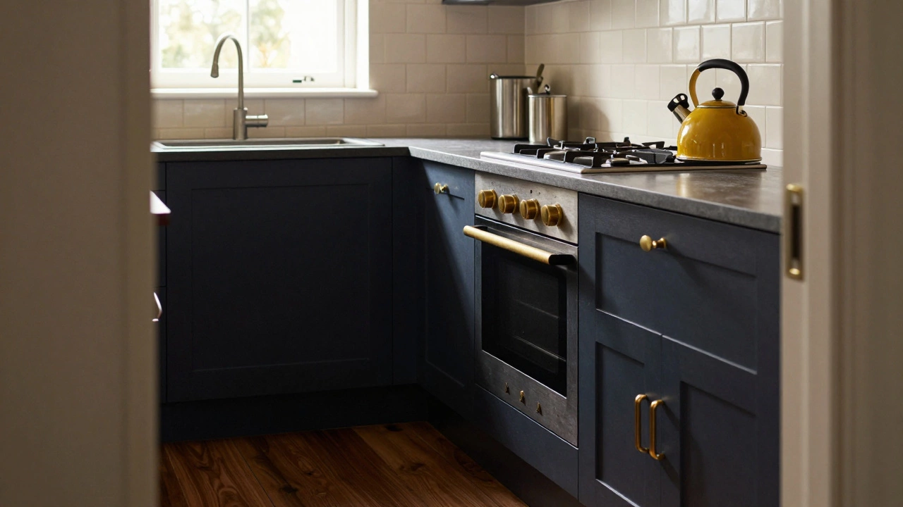
Real kitchen examples
Let’s say you have a modern kitchen with white shaker cabinets. That’s your 60%. Your countertops are a cool gray quartz-that’s your 30%. Now, add a single row of navy blue tiles behind the stove, or a set of copper bar stools. That’s your 10%. Instant depth. Instant warmth.
Another example: dark walnut cabinets (60%), cream-colored subway tile backsplash (30%), and a bright yellow kettle or hanging herb pots (10%). The contrast feels intentional, not random.
One common mistake? People try to use the 10% on too many things. Two red chairs, a red rug, red curtains, and a red toaster? That’s not 10%. That’s 40%. And now your kitchen looks like a candy store.
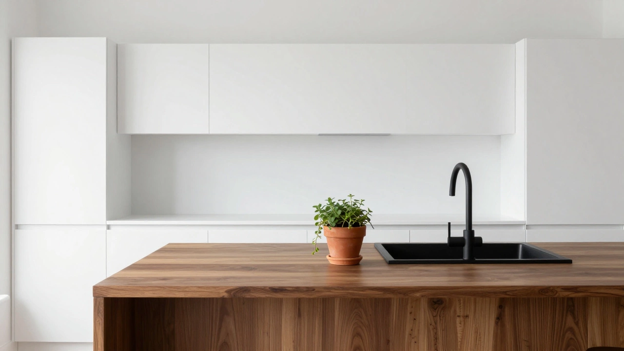
What if your kitchen is all white?
White kitchens are popular-but they’re also risky. Pure white can feel cold. If you’ve gone all-white, you’re already at 60% or more. The 30% needs to come from texture: a wooden island, woven baskets, a matte black faucet, or a patterned rug. Then, the 10% can be a single bold item-a green plant in a terracotta pot, a copper mixing bowl on the counter, or even a framed print with a pop of color.
Texture becomes your color. A matte finish, a brushed metal, a rough-hewn wood-all of these add visual weight without adding pigment.
Common mistakes to avoid
- Using too many neutrals. If your 60%, 30%, and 10% are all shades of gray, you’ll end up with a space that feels lifeless. Even neutrals need contrast in tone-light, medium, dark.
- Ignoring lighting. Natural light changes color. A gray that looks perfect in morning sun might look blue at night. Always test paint or tile samples at different times of day.
- Forgetting the ceiling or trim. These count. If your ceiling is white and your trim is black, they’re part of your palette. Don’t treat them as afterthoughts.
- Buying everything at once. Start with the 60% and 30%. Wait a few weeks. Live with it. Then pick your 10% based on what feels missing. Impulse buys ruin balance.
Does it work for small kitchens?
Absolutely. In fact, it’s even more important in small spaces. Without balance, a tiny kitchen can feel cluttered. The 60-30-10 rule helps you create visual breathing room. Use lighter tones for the 60% to make the space feel bigger. Let the 30% bring warmth. Save the 10% for something functional-like a colorful pot rack or a single statement light fixture.
Even in a galley kitchen, you can apply this. The walls = 60%. The countertops = 30%. The hardware on your cabinets = 10%.
What about materials and textures?
The rule isn’t just for color-it applies to materials too. If your cabinets are glossy (60%), your backsplash is matte tile (30%), then your stools are woven rattan (10%), you’re still following the rule. Texture adds depth just like color does.
Think of it this way: a polished stainless steel fridge (60%), a stone countertop (30%), and a hand-thrown ceramic bowl on the counter (10%) creates the same rhythm as color.
Final thought: Balance beats trend
Trends come and go. A kitchen painted in last year’s “it” color can feel dated in two years. But a kitchen balanced with the 60-30-10 rule? It ages gracefully. It’s timeless because it’s built on human perception-not Instagram filters.
You don’t need to spend a fortune. You don’t need to hire a designer. Just ask yourself: What’s the main thing? What supports it? And what makes you smile? That’s your 60-30-10.
Can the 60-30-10 rule be used in other rooms besides the kitchen?
Yes, absolutely. The 60-30-10 rule works in any room where color and texture matter-living rooms, bedrooms, bathrooms, and even home offices. It’s one of the most reliable tools in interior design because it’s based on how the human eye naturally processes visual information. A living room with 60% neutral sofa, 30% textured rug, and 10% vibrant throw pillows is just as balanced as a kitchen using the same formula.
What if I don’t like bold accent colors?
You don’t need neon or bright red. The 10% can be subtle. A matte black faucet, a brass hinge, a single wooden shelf, or even a black-and-white photo on the wall can serve as your accent. The goal isn’t to shock-it’s to create a focal point that feels intentional. Sometimes, a quiet contrast is more powerful than a loud one.
Do I have to paint my cabinets to follow this rule?
No. Your 60% can be your flooring, your countertops, or even the wall color. Many kitchens use natural wood cabinets as the 60% base. Your 30% might be the backsplash or the island. The 10% could be your hardware, lighting, or a single piece of cookware. The rule is flexible-it’s about proportion, not surface type.
Can I use patterns instead of solid colors?
Yes, but be careful. A busy pattern counts as one color family, not multiple. For example, a striped backsplash with navy, white, and gray still falls under your 30% if the dominant color is navy. The key is to keep the pattern’s main color aligned with your 60% or 30% and use the 10% for a solid accent elsewhere. Don’t mix multiple patterns unless they share the same color family.
Is there a variation of this rule for modern kitchens?
The rule doesn’t change-it’s universal. But modern kitchens often use a 70-20-10 split: 70% white or light gray (for a clean look), 20% wood or metal (for warmth), and 10% black or a single bold accent (like a red door or a matte black sink). It’s still 60-30-10 in spirit, just adjusted for minimalist aesthetics. The core idea remains: one dominant, one supporting, one surprising.
Start with what you’ve got. Look around your kitchen. What’s the biggest thing? That’s your 60%. What’s the next thing you notice? That’s your 30%. What makes you stop and think, ‘I love that’? That’s your 10%. You already know how to balance it-you just needed the framework to see it.