The 2-3 Rule: Mastering Wall Art for Perfect Balance
When it comes to decorating your living space, the art of arrangement is key. A harmonious display of wall art not only enhances visual appeal but also reflects your personal style. The 2–3 rule is a simple guideline that helps achieve balance and prevents the overload of visual clutter.
This strategy focuses on simplicity by grouping artworks in pairs or trios, creating a cohesive and appealing look. It’s about letting each piece breathe while forming a unified whole that invites interest without chaos. Whether you are refreshing a familiar room or decking out a new space, understanding this rule can be your secret weapon for stylish decor.
- Understanding the 2-3 Rule
- Why It Works in Wall Art
- Applying the Rule to Your Space
- Choosing the Right Artwork
- Tips for Arrangement and Spacing
- Common Mistakes to Avoid
Understanding the 2-3 Rule
The 2-3 rule in decorating is a clever way to bring balance and style into your home, especially when it comes to wall art. This rule comes to life when we understand that symmetry isn't always the key to beauty, rather, a touch of asymmetry can allure the eye expertly. The essence of the 2-3 rule is simplicity: pair items in twos or arrange them in groups of three for a captivating look. This technique finds its roots in the idea of creating natural clusters that delight without overwhelming, giving each piece room to breathe, all while crafting a visual path for viewers.
Throughout history, artists and interior designers have leaned on this concept to establish harmony. Picture a trio of modest canvases lined up or two striking black-and-white photographs flanking either side of a houseplant. The magic over here lies in the choices you make, inviting viewers to explore rather than skimming over in haste. Esteemed interior designer Nate Berkus once stated,
"Good design is about creating balance, and the 2-3 rule is one of the best tricks to achieving that."Emphasizing fewer, well-curated items not only enhances the feeling of spaciousness but introduces a rhythm that resonates through the room.
Adopting the 2-3 rule requires attention to detail as well as a dab of creativity. When hanging your art, consider the varied heights and dimensions within a group, allowing the arrangement to not merely fit but to sing within its space. Assess the negative space too, as it is just as significant as the elements filling it. This technique often resonates with a deeper human inclination for simplicity and elegance. Research in neuroaesthetics even suggests human eyes are instinctively drawn to groupings and patterns, aligning well with this rule. By fostering a meticulous yet inventive mentality, you can stitch your artworks into one coherent tapestry, pulling any room together seamlessly.
Why It Works in Wall Art
The 2-3 rule is not just an arbitrary guideline thrown around by interior decorators to add a layer of complexity to decorating walls. It's grounded in our very perception and understanding of visual balance, which makes it effective in creating engaging and harmonious spaces. The human brain is incredibly adept at recognizing patterns and seeking symmetry, and this rule taps into this intrinsic capability. By organizing wall art in groups of twos or threes, it aligns with our natural tendency to appreciate the balance and flow of visual elements.
Implementing the 2-3 rule allows for a sense of dynamic equilibrium within a space. When observing wall art, the mind easily resolves odd numbers, like three, achieving a pleasing aesthetic without overwhelming the sense of order. Psychologists suggest that odd-numbered groupings generate movement and interest, an insight that sophisticated marketers and designers have leveraged for years. This crucible of theory and practice explains why the 2-3 rule holds such sway in decorating, seamlessly creating a flicker of sophistication without chaotic distraction.
Of course, the aesthetic allure of the 2-3 rule is not merely theoretical. Consider its continuous popularity and efficacy by looking at how often it appears in notable art exhibits and luxury design showcases across the globe. Susan Abercorn, a celebrated designer, explains,
"Utilizing odd-numbered clusters in decor invites subtle focus and engagement, a strategy as old as design itself."This piece of advice is echoed in the works of renowned artists and designers who adopt and adapt such rules in their creative processes. Knowing that getting the numbers right often results in something as enriching as a Matisse exhibition itself is reason enough to try your hand at this powerful design tool.
At its core, implementing the 2–3 rule also breaks away from the monotony that occasionally dulls spaces abundant with art. This composition trick encourages variety in a controlled manner, ensuring every wall tells a vibrant story. Such arrangements permit unique pieces to complement rather than clash, allowing specific color schemes or themes to shine through. This is particularly important in spaces like living rooms or galleries, where art must often converse with myriad other design elements. By applying the rule, one can adopt a structured approach to creativity, mixing pieces of varying sizes, styles, and subject matter without losing coherence. The element of play between synchrony and surprise is what imbues rooms with drama and allure.
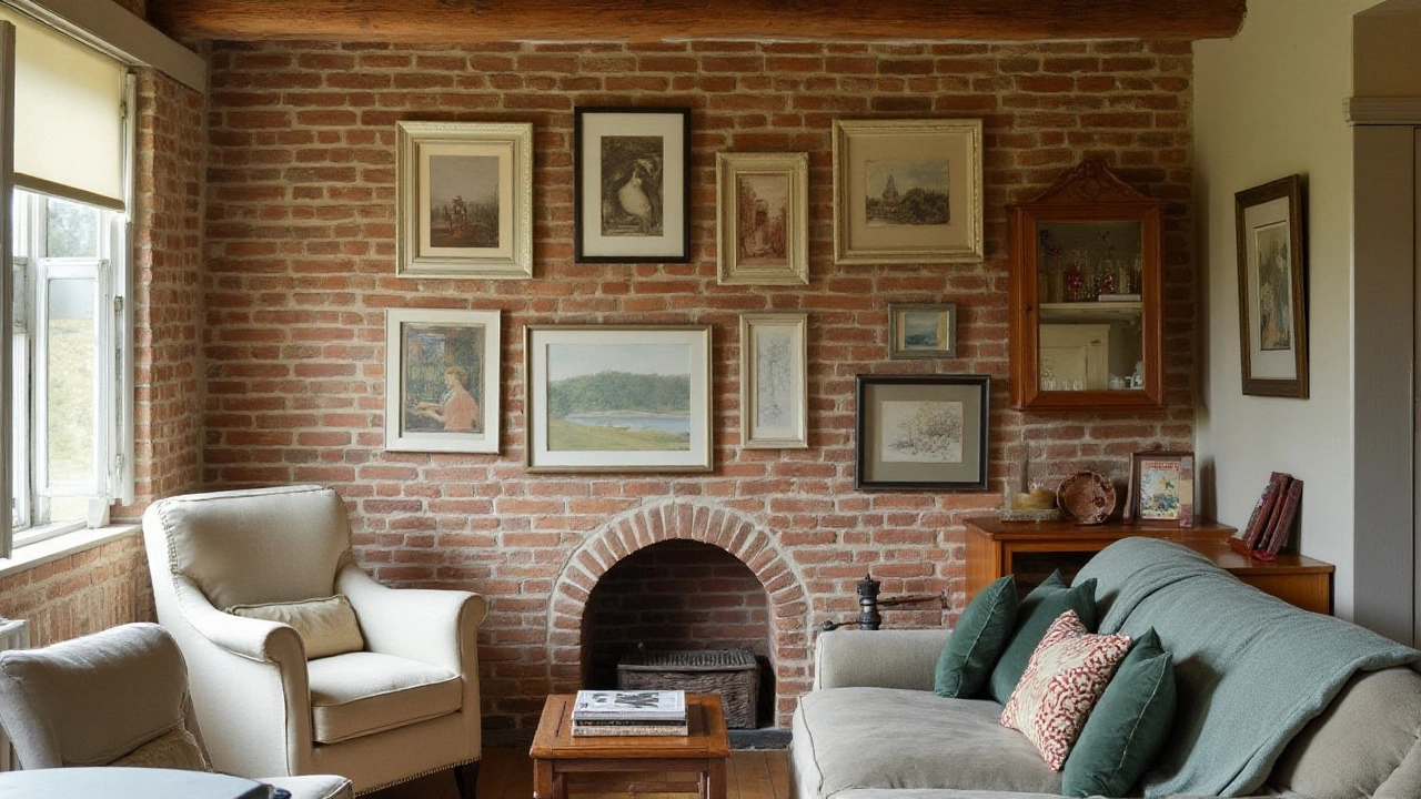
Applying the Rule to Your Space
The 2-3 rule is a guiding principle that resonates well beyond the confines of art galleries; it finds meaningful expression in the cozy corners of our homes. You might not realize that your living room, with its stark white walls, serves as an inviting canvas yearning for a splash of artful creativity. To harness the transformative power of this rule, it's important to understand how to seamlessly integrate it into the architectural and interior design elements of your space. This doesn't mean you need to overhaul your entire setup; even small tweaks can yield striking aesthetic dividends. One smart approach is to view each wall as its own story, crafting a narrative one wall art piece at a time.
Among the key considerations when implementing the 2-3 rule is the notion of spacing and proportion. Imagine you're standing in front of your chosen wall. First, consider its dimensions to ascertain the optimal size of artwork grouping. A balance should be struck between wall space and the art: large walls can accommodate bolder, expansive grouped pieces, while smaller sections might benefit from more intimate pairings. Here's a tip: let space between each piece breathe illusionary life into the artwork, enhancing their individual presence while still allowing them to speak to one another.
Further, the alignment and theme of art collection should enhance the room's mood, reflecting personal narratives while sustaining harmony. For instance, if your room embraces a coastal vibe, art centered around marine themes will tie everything together beautifully. Similarly, to highlight similarities without redundancy, vary the frame styles for each piece, with consistent tones to maintain visual continuity. Interesting fact: Curators often leverage variations of this rule to manage galleries' expansive walls, enabling a viewer-friendly navigation through complex exhibitions.
Arranging Artwork for Maximum Impact
As you dig deeper into the application of the 2-3 rule, visualize how artworks interact beyond the limitations of a flat plane. Art need not always hang at eye level—in fact, varying height planes can inject dynamism. Begin with the placement at the center, which serves as the focal point, before spiraling outward, adding a sense of both depth and movement. Artists suggest letting your center point align with sightlines at seated heights, perfect for spaces that encourage relaxation, like lounges or family rooms. To keep your compositions fresh, occasionally switch out artworks based on current emotions or seasons, grounding your living space as a reflection of temporal moods.
Design expert Nate Berkus once stated, "Your home should tell the story of who you are and be a collection of what you love." This insight affirms the idea that your choice of wall art and its grouping are not just about aesthetics but a profound narrative of your character and experiences.
Considering Elements of Color and Texture
Color palettes form another dimension to consider. By selecting artworks that resonate with the existing tones of the room, you uphold cohesion and prevent visual discord. You're not just matching colors; there’s room for thoughtful contrast too. For example, an abstract piece with bold reds can invigorate an otherwise muted beige room, acting as a magnetic focal allure. Texture is no less important—canvas prints alongside metallic frames or wooden carvings can add tactile diversity, compelling a double-take as natural light shifts across the day. These creative inputs ensure that each aspect of your wall art serves as a conversation starter, a reflection of your curated style.
Moreover, if you're a stats person, research indicates that 74% of interior designers utilize groupings like the 2-3 rule as it provides balance and symmetry which are key to visual satisfaction in a space. As you delve into this strategized artistry, imbue the choices with facets of joy, experimentation, and above all—a sense of passion. When art is hung with intent and treasured memories, the ambiance of warmth tends to follow.
Choosing the Right Artwork
When embarking on the journey of selecting artwork for your home, let’s transform the task into a delightful and enriching part of your decor process. The magic of wall art lies not only in its beauty but also in how effortlessly it weaves into the fabric of your home’s aesthetic narrative. The right pieces can anchor a room, make a loud statement, or offer a whisper of subtle grace. Take the time to captivate your senses by examining pieces that resonate personally. As you consider your selections, remember that the best art speaks directly to the viewer, stirring emotions and memories alike.
Begin by considering the existing color palette of the room where the art will live. Complementary colors in your wall art can either harmonize with the hues already in place or offer a striking contrast that packs a design punch. The use of color can dictate the mood of the room—blues for tranquility, reds for warmth, or bright yellows to invigorate the space. Furthermore, you might explore themes and subjects that reflect your personality or echo your passions. Art is an excellent conversation starter, so take advantage of choosing something that sparks curiosity or a shared love with guests.
"Art enables us to find ourselves and lose ourselves at the same time." — Thomas Merton
Once you have found pieces that enthrall you, it’s important to consider the available wall space. The size and scale of the artwork relative to your wall are pivotal to achieving balance in accordance with the 2-3 rule. Large pieces might best suit a feature wall or remain solitary to make a statement, while smaller pieces can be grouped for more intricate displays. The spacing between these artworks can influence the flow of a room. Aim for cohesion by maintaining a consistent distance between pieces. Consider employing the rule of thirds as a guideline, dividing the wall into sections to help distribute visual weight evenly across the space.
Material and medium are significant factors too. Photography, paintings, prints, and eclectic forms of mixed media can bring different textures and dimensions to a room, enhancing the sensory experience of your decor. Canvas prints offer a rustic and vintage flair, while glossy photographs might suit a more modern, sleek environment. It can be truly rewarding to mix materials to create depth—a tapestry here, a framed print there, each adding its unique charm. When mixed strategically, different media can seamlessly blend to form a cohesive but varied gallery wall.
Consider Art with Personal Stories
Personal artifacts and treasured finds often hold as much value in artistry as commercially acquired works do. Family heirlooms, travel souvenirs, or local artist acquisitions bring a personalized touch to your decor. These items may evoke cherished memories or serve as bold cultural narratives, allowing your space to reflect who you are on an intimate level. Remember, in art, what resonates with you will likely resonate with your guests. Embrace personal connections in your decorating efforts, for they enrich your home with storytelling and character.
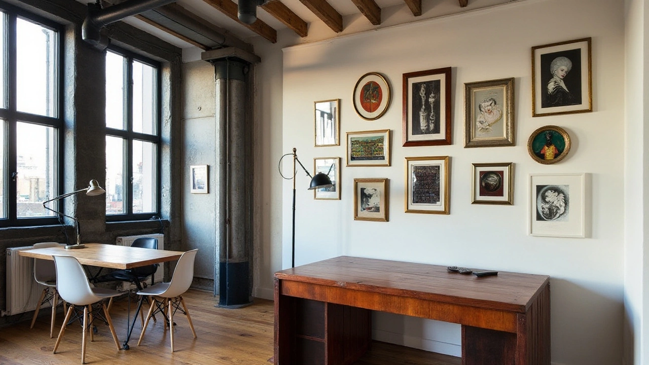
Tips for Arrangement and Spacing
Arranging wall art is an art form in itself, with each piece playing a critical role in the dance of balance and proportion. When using the 2-3 rule, spacing becomes pivotal in ensuring each piece has room to breathe while contributing to an engaging collective visual. Let's delve into some expert tips to guide you in perfecting your wall art arrangement.
The first factor to consider is height. Ideally, artwork should be hung at eye level to create a more natural and comfortable viewing experience. In any given room, eye level can vary, but a standard guideline is to center the art about 57 to 60 inches from the floor. This may seem trivial, but it makes a world of difference in how the art feels within the space. When artworks are grouped, the center of the cluster should adopt this guideline too, keeping the wall art intimate and accessible.
Now, on to spacing, which is where the magic of the 2-3 rule truly unveils itself. A good rule of thumb when spacing is maintaining a gap of 2 to 3 inches between pieces. This provides uniformity and allows each piece to stand out without overwhelming the viewer. Some experts suggest an increased gap for larger pieces or when combining different sizes, which contributes to a more dynamic balance that captivates the eye. Listen to what your space tells you, as sometimes larger gaps foster a more airy and open feel.
"The key to a well-arranged art wall lies in the balance of shapes, sizes, and the spaces in-between," says interior designer Emily Henderson, a known authority in home styling.
Grouping with Harmony
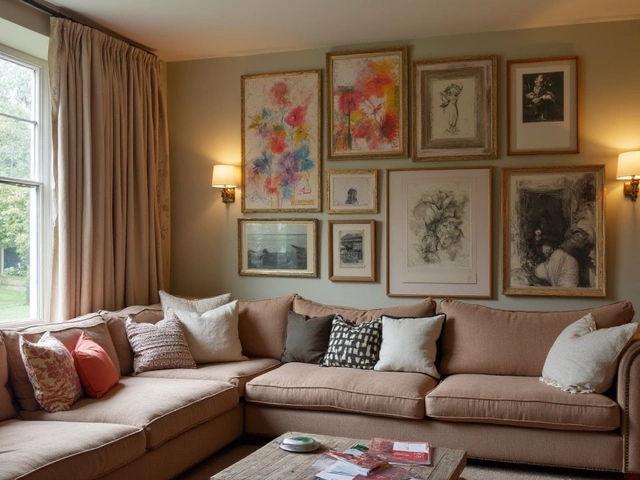
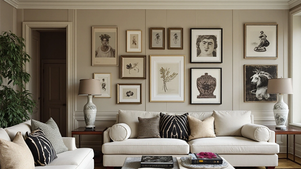
One effective way to ensure harmony is by sticking to a theme, whether through color palette, art style, or the frames themselves. For instance, when you have a series of watercolor landscapes or monochrome photography, keeping frames within a similar color or material palette can unify the entire arrangement under one thematic banner. When you converse with the 2-3 rule, these groups often appear as two or three art pieces working together to relay a cohesive narrative.
Furthermore, the choice of frame plays an understated but vital role in wall art display. A cohesive mix of frames in complementary hues can pull disparate pieces together into a single, seamless story. Remember, while diversity in art styles and subjects can add interest, consistency in presentation, such as similar frame thickness or matting, functions as the glue that binds them all.
- Avoid lining up all frames although in a rigid straight line; instead, experiment with different alignments. Staggered, slightly uneven arrangements can lend an organic feel to your decor.
- Consider the furniture and features around your artwork; positioning should complement, not compete.
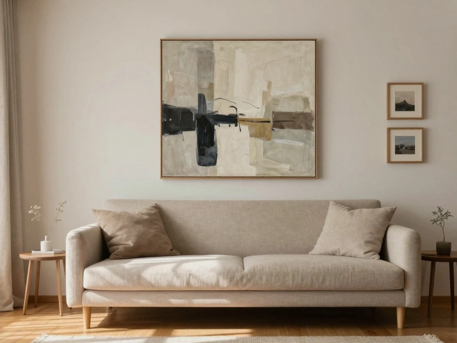
- If a sumptuous sofa or artful armchair occupies a room, larger wall art should anchor above it to create focal balance.
- Collaborate the negative space between frames with other elements like bookshelves, mirrors, or plants to bolster the character of your room.
The end result, with these tips, should be a well-thought-out collection where each piece is not just a solitary element but part of a greater whole harmonized through mindful spacing and arrangement. As you refine your approach with the 2-3 rule, the outcome will undoglely reflect an abode resonating with both elegance and personal expression.
Common Mistakes to Avoid
When embracing the 2-3 rule in decorating wall art, certain pitfalls can easily disrupt the elegance you aim to create. While it's tempting to unleash your inner artist with captivating arrangements, ensuring the display doesn't turn into visual chaos is crucial. A frequent misstep is overcrowding, where too many wall art pieces are crammed together, losing their individual allure and rendering the grouping overwhelming. As the goal is to achieve a clean and visually appealing effect, remember less is more. Allow each piece its moment, avoiding the temptation to fill every space on your wall.
The act of neglecting scale and proportion is another common error. Artworks may vary vastly in size, and when mismatched without a thoughtful layout thinking strategy, the outcome can lack harmony. Proportions must be thoughtfully considered, ensuring each 2-3 grouping feels balanced. For large walls, choose larger or several medium pieces grouped appropriately to avoid awkward empty spaces. On compact walls, utilize smaller art both horizontally and vertically aligned to maintain attention without overwhelming the observer.
One might think color coordination isn’t paramount, but ignoring it can lead to distracting clashes. Without a consistent color scheme, your home decor could feel disjointed. Select your artworks with shared tones or complementary hues, integrating them into the existing room palette. This doesn’t mean everything should match strictly, but they should converse with one another. Employing varied textures within the color theme can add depth and interest without straying from the overall vision.
Lastly, falling into the 'art height' trap is regrettably common. Placing artwork too high or low disrupts the natural line of sight, rendering the display less inviting. Position the centerpiece of a gallery wall at eye level, approximately 57-60 inches from the floor for optimal viewing. Practicality insists centering especially large pieces with their midpoint aligned with this guideline.
"Art should be transferred directly from the heart of the artist to the heart of the observer." — Rodin
Encouraging creativity while adhering to trusted principles can create opportunities for your decorating tips to shine genuinely. While occasionally breaking the rules can invite new ideas, understanding why these mistakes should be avoided helps build a timeless foundation for your favorite spaces.
