What Color Kitchen Looks Expensive? Premium Palettes for 2026
Kitchen Luxury Estimator
Answer four key questions to see if your kitchen choices align with the "Premium Palettes for 2026" standards.
Analysis Complete
Pro Tip:
Key Takeaways
- Mono-chromatic schemes often signal luxury by eliminating visual clutter.
- Matte finishes on cabinetry currently read more expensive than high-gloss lacquer.
- Darker hues like charcoal or navy require better lighting to maintain warmth.
- Hardware choices heavily influence whether a color palette feels budget or bespoke.
- Material contrast between matte paint and polished stone elevates perceived cost.
The Psychology Behind "Expensive" Kitchens
Walking into a room, you don't immediately calculate the square footage or brand names of the appliances. Instead, your brain reacts to harmony. An expensive-looking kitchen often relies less on price tags and more on cohesion. A space feels custom-made when every element-the wall color, the cabinet finish, the countertop, and even the flooring-speaks the same language.
Many homeowners believe white is the default choice for a high-end look, which was true years ago. However, we are seeing a shift toward depth and texture. To make a space feel valuable, you need to reduce visual noise. A cluttered palette of beige cabinets, cream walls, and wood floors creates vibration. By unifying these elements, you create a sense of calm authority that equates to luxury in the mind of anyone entering the room.
When we discuss what makes a kitchen look expensive, we aren't just talking about the paint chip. We are discussing how light interacts with the surface. High-quality paint application matters more than the specific hue. A perfectly smooth, painted cabinet door in a standard shade of grey will outperform a trendy color applied poorly with brush marks showing.
Why Monochrome Works Better Than Multicolor
If you want to impress clients or potential buyers without spending a fortune on renovations, monochrome is your strongest tool. This approach involves choosing a single dominant color family and varying the intensity rather than changing the hue completely.
Monochromatic Design is Single-Tone Scheme, characterized by using different shades of one color to create a seamless flow.For example, pairing charcoal cabinets with slightly lighter grey walls and slate-grey backsplash tiles creates a cocoon effect. This continuity tricks the eye into seeing the space as larger and more intentional. In contrast, mixing warm wood cabinets with cool blue walls often creates friction in the design unless bridged carefully.
In New Zealand homes specifically, where natural light fluctuates seasonally, monochrome helps keep the kitchen feeling grounded. A stark black and white contrast might feel clinical during the darker winter months, whereas a layered taupe or soft grey palette maintains warmth while still feeling curated.
The Best Color Families for Luxury Appeal
While personal taste dictates the exact shade, certain color families consistently convey higher quality due to their versatility and ability to hide imperfections.
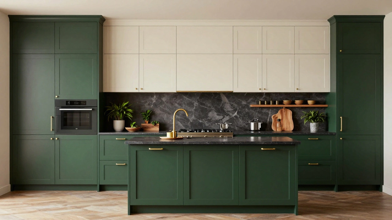
1. Deep Earthy Greens
Olive, sage, and forest green have transitioned from farmhouse staples to modern luxury markers. When applied to lower cabinets paired with lighter upper cabinets or walls, they ground the space. These tones work exceptionally well with brass hardware, creating a rich historical feel reminiscent of classic English kitchens.
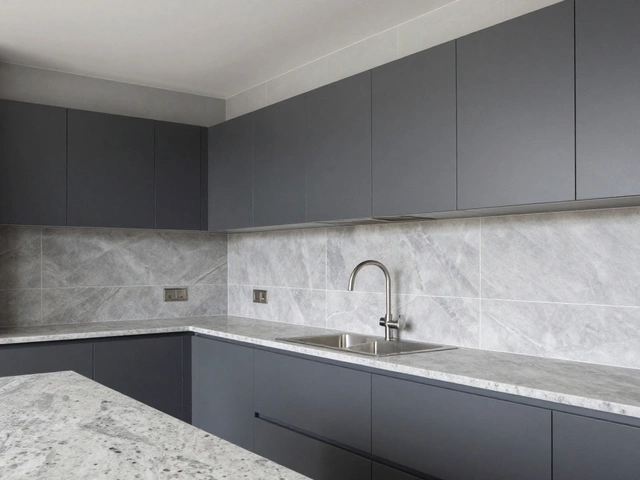
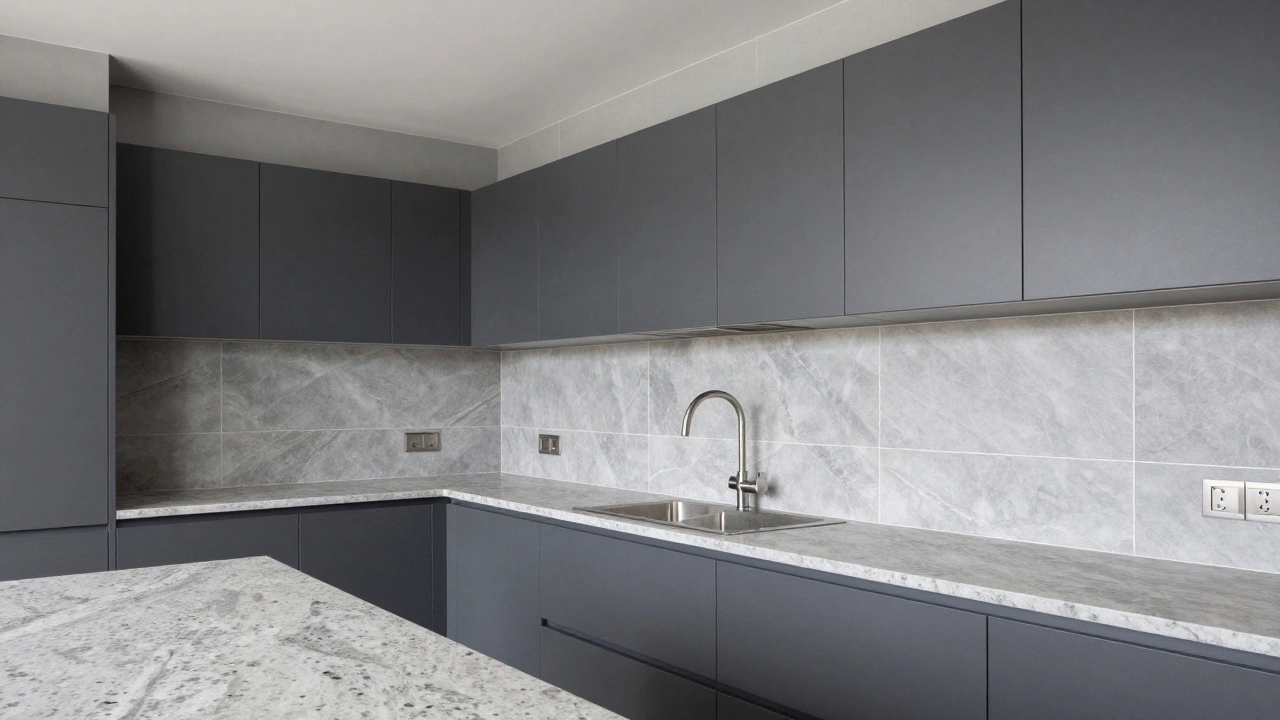
2. Cool Grey and Graphite
Silver-grey remains timeless. To avoid it looking dated (like the stainless steel trend of the 2010s), pair cool greys with textured stone or organic wood elements. Darker graphite shades absorb light, making them look substantial and durable. They hide scratches on painted laminate surfaces better than off-whites do.
3. Warm White and Cream
Pure white can sometimes appear sterile. For a richer, more expensive vibe, switch to creamy whites or "greige" (grey-beige). This neutral allows colorful artwork, potted plants, or statement lighting to pop without competing with the architecture. If you choose white, ensure it doesn't clash with the grout lines in your tile; matching the grout color to the tiles is a small detail that costs little but adds significant polish.
4. Navy Blue
Navy is a sophisticated alternative to black. It offers high contrast against light countertops but brings more warmth. In smaller kitchens, navy lowers the ceiling visually, adding intimacy, whereas in open-plan spaces, it defines the cooking zone effectively.
How Finish Quality Impacts Price Perception
You could paint your cabinets the most trendy Pantone color of the year, but if the finish is the wrong type, the room won't read as high-end. The finish determines how much light bounces off the surface.
| Finish Type | Luxury Rating | Better For |
|---|---|---|
| Matte / Satin | Very High | Modern interiors, hiding fingerprints |
| Gloss / Lacquer | Moderate | Reflecting light in dark rooms |
| Natural Wood | High (if solid) | Traditional or Scandinavian styles |
| Thermoforce Laminate | Low | Budget renovations requiring durability |
Pairing Colors With Materials
A color is rarely seen in isolation. It sits next to countertops, sinks, and appliances. To achieve a premium look, the relationship between these hard surfaces and painted surfaces must be deliberate.
Countertop Contrast
If you go with dark cabinets, you generally need a lighter countertop to prevent the room from feeling cave-like. Quartz Surfaces are durable, low-maintenance, and come in consistent patterns that mimic high-cost stone like marble. Using a white or light grey slab provides a stage for food prep and keeps the eye moving horizontally.
Conversely, if your cabinets are white or light oak, introducing a dramatic dark countertop anchors the room. Veined marble (or engineered stone imitating it) bridges the gap between casual and formal. Avoid busy speckled patterns on large islands; they tend to break up the flow and look more residential than boutique.
Backsplash Continuity
One of the biggest mistakes leading to a "cheap" appearance is a mismatched tile. If your wall cabinets end and your wall begins, try extending the backsplash material upwards behind the range hood, or even to the ceiling. Large-format porcelain tiles are superior for this because they minimize grout lines, which reduces visual fragmentation.
The Role of Metal Hardware
Even the smallest metal component changes the temperature of the room. Mixing metals carelessly-say, chrome handles on copper sinks-can look accidental rather than designed. Consistency is usually safer.
Brushed Brass Hardware has been a dominant trend for several years and continues to age well. It adds a golden glow that warms up cooler grey or navy paints. Brushed nickel is the safe bet for contemporary spaces, offering a sleek silver tone that matches stainless steel appliances seamlessly.
However, consider switching the island hardware to something different to define the space. If the perimeter cabinets use matte black pulls, try gold knobs on the island drawers. This subtle distinction tells the viewer that the island is a separate functional zone, which is a hallmark of good kitchen planning.
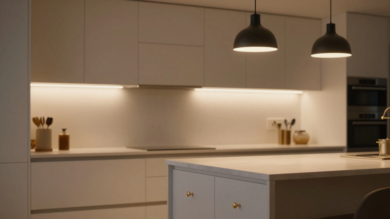
Lighting: The Silent Makeover Tool
You can select the perfect color palette, but poor lighting can ruin the illusion of expense. Standard builder-grade recessed lights often cast harsh shadows under cabinets, highlighting dust and texture variations in paint.
To sell the look of luxury, install dedicated task lighting underneath the upper cabinets. This washes light across the counter, making the workspace usable and reflecting off glossy finishes. Dimmable fixtures are essential because they allow you to change the atmosphere from bright morning energy to soft evening relaxation. Low-voltage puck lights are outdated; opt for hidden LED strips with diffusers that hide the individual diode dots.
Trends Predicting Future Value
Since today is early 2026, understanding longevity is vital. Investing in a trendy neon accent might feel fun now, but resale buyers often find it overwhelming. Stick to neutrals for fixed elements like cabinets and flooring. Inject personality through moveable items like rugs, curtains, or accessories.
Biofilic design continues to rise. Incorporating indoor plants, natural wood accents, and earthy tones mimics the outdoors. This connects the home to nature, which psychologically increases relaxation and perceived value. In our Auckland context, using native timber textures alongside a clean, modern palette honors local heritage while maintaining modern efficiency.
Does painting kitchen cabinets increase resale value?
Yes, provided the paint job is professional grade. Replacing old wood cabinets is costly, so high-quality repainting in neutral, modern colors updates the look significantly without the demolition waste. Buyers appreciate the time saved on renovations.
Are two-tone kitchens still stylish in 2026?
They remain popular but execution is key. The split should follow function-typically dark island/light perimeter or vice versa. Mismatched random colors without a unifying thread will look disjointed and dated quickly.
Is black too difficult to keep clean for a main kitchen?
It depends on the finish. Glossy black shows every fingerprint. Textured matte finishes or dark greys are much more forgiving regarding smudges, dust, and water spots, making daily maintenance easier.
Can I mix wood grain cabinets with painted ones?
Absolutely. This combination bridges the gap between warmth and minimalism. Just ensure the undertones align. Warm oak pairs best with creamy whites, while walnut complements deeper greys or blacks.
What color is best for selling a house quickly?
Soft white, grey, and sage green offer the widest appeal. These colors allow buyers to visualize their own furniture in the space. Highly saturated or personalized colors narrow the buyer pool.