Best Relaxing Bathroom Colors: The Ultimate Guide to Calm Spaces
Bathroom Color & Lighting Simulator
Select Your Palette
Choose a wall color:
Simulate Lighting:
Relaxing Atmosphere
Crisp and calming.
Analysis
Soft Blue under Natural Daylight appears crisp and true to its hue. It promotes mental clarity and feels refreshing, perfect for a morning routine.
Picture this: you walk into your bathroom after a long, stressful day. The lights are dimmed, the air is warm, and for a split second, your shoulders drop. You feel it. That’s not just good lighting or soft towels; that’s color working in your favor. But pick the wrong shade, and that same room feels like a sterile hospital waiting area or a cramped closet. So, what color is actually relaxing for a bathroom? It’s not just about picking "blue" because everyone says so. It’s about understanding how light, space, and psychology interact to create a true sanctuary.
The Science of Calm: Why Color Matters
Your brain reacts to color before you even realize it. This isn't woo-woo magic; it's biology. When you look at certain hues, your nervous system shifts. Cool tones generally lower heart rates and blood pressure, while warm tones can either energize or comfort, depending on their saturation. In a small, often windowless room like a bathroom, color does heavy lifting. It defines the mood, alters the perception of space, and sets the stage for relaxation.
If you want a relaxing bathroom, you need to move beyond basic primary colors. You need nuance. A bright royal blue might scream "energy," but a muted slate blue whispers "serenity." The key lies in saturation and temperature. Highly saturated colors (think neon green or fire engine red) stimulate the brain. Desaturated colors (grays, beiges, pastels) allow the mind to rest. For a bathroom, we are looking for the latter. We want visual silence.
Top 5 Relaxing Bathroom Colors Explained
While personal preference plays a role, some colors consistently rank higher in creating a spa-like atmosphere. Here are the top contenders, broken down by why they work and how to use them effectively.
1. Soft Blues: The Classic Choice
Soft Blue is a cool, low-saturation hue reminiscent of clear skies and calm waters. It is the undisputed champion of relaxation. Studies in environmental psychology have shown that blue environments reduce anxiety and promote mental clarity. In a bathroom, blue connects us with water-the very element the room is built around.
- Best Shades: Sky blue, powder blue, or dusty aqua.
- Why it works: It lowers perceived temperature, making steamy showers feel refreshing.
- Pro Tip: Avoid dark navy on all four walls unless you have large windows. Navy can make a small bathroom feel like a cave. Use it as an accent wall or on cabinetry instead.
2. Sage Green: Nature Indoors
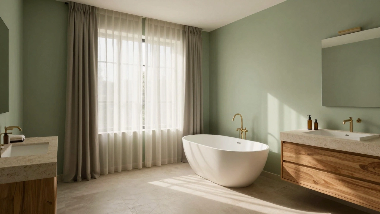
Sage Green is a muted, grayish-green tone inspired by dried herbs and forest foliage. If blue is the sky, sage is the earth. It brings a sense of organic balance into the home. Green is the easiest color for the human eye to process, which means less visual fatigue. This makes sage green perfect for morning routines where you might be rushing, or evening baths where you want to unwind.
- Best Shades: Olive drab, seafoam, or pale mint.
- Why it works: It pairs beautifully with natural materials like wood, stone, and plants.
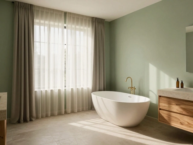
- Pro Tip: Combine sage walls with white subway tiles and brass fixtures for a modern, yet grounded look.
3. Warm Neutrals: Beige and Greige
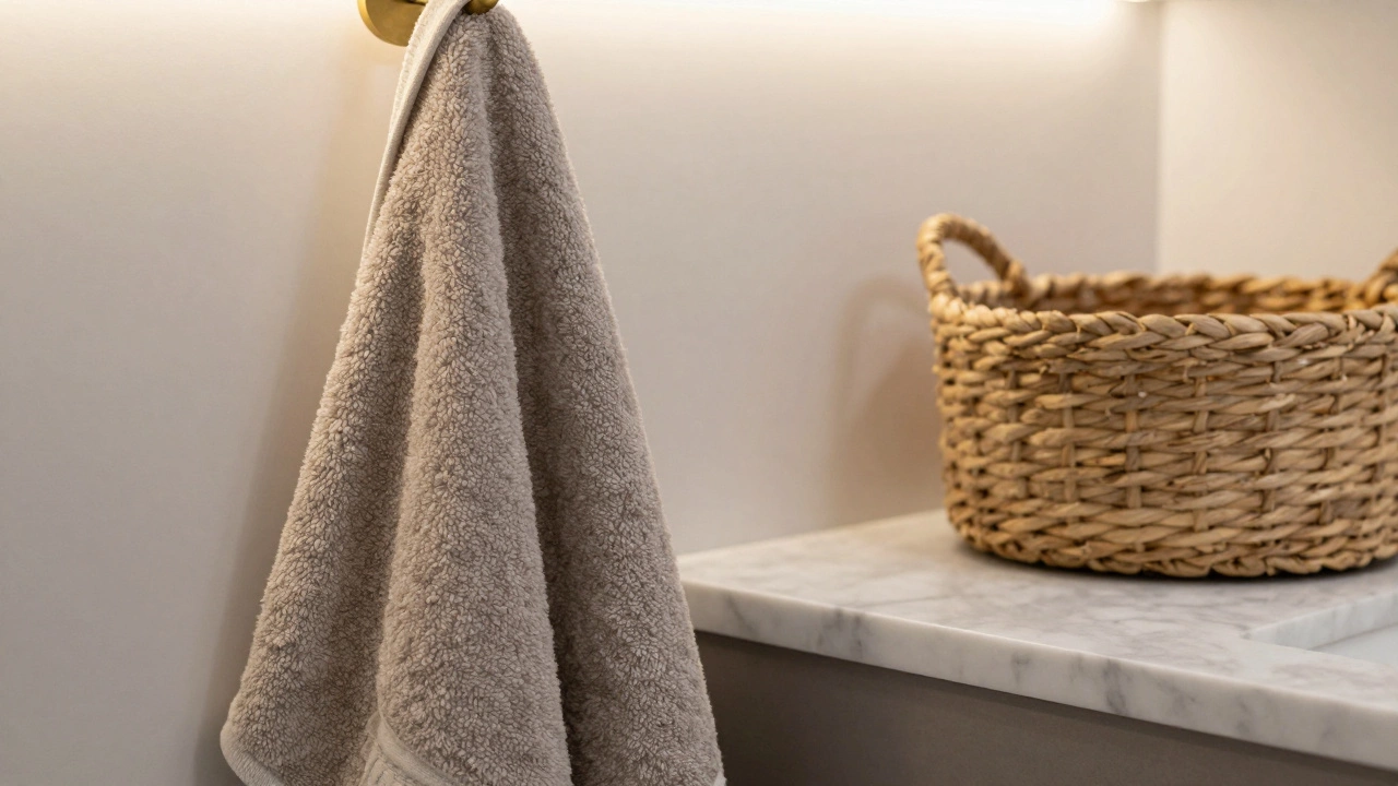
Let’s talk about beige. It got a bad reputation for being boring, but Greige is a sophisticated blend of gray and beige that offers warmth without yellow undertones. Pure white can feel clinical and cold, especially under harsh fluorescent lighting. Warm neutrals add depth and coziness. They act as a blank canvas that lets textures-like woven baskets, linen towels, and marble countertops-shine.
- Best Shades: Oatmeal, taupe, or warm sand.
- Why it works: It creates a seamless flow if your bathroom opens directly into a bedroom or hallway.
- Pro Tip: Test samples in both morning and evening light. Beige can turn orange in the afternoon sun if the undertones aren't right.
4. Lavender and Lilac: The Spa Secret
You’ve seen it in luxury spas. Lavender isn’t just a scent; it’s a visual cue for relaxation. Lavender is a soft purple hue associated with tranquility and spiritual balance. Purple combines the stability of blue and the energy of red, but when desaturated into lilac or lavender, it becomes incredibly soothing. It adds a touch of whimsy and luxury without being overwhelming.
- Best Shades: Pale lilac, wisteria, or mauve.
- Why it works: It feels indulgent and feminine, breaking away from the typical masculine leanings of gray bathrooms.
- Pro Tip: Keep accessories minimal. Too much pattern with lavender can become chaotic. Stick to clean lines.
5. Charcoal Gray: Moody Elegance
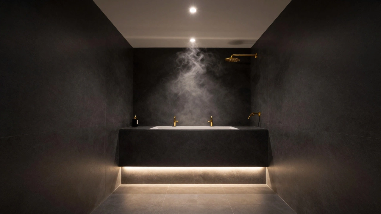
Relaxation doesn’t always mean light and airy. For many, darkness is comforting. Charcoal Gray is a deep, neutral tone that provides contrast and sophistication. Think of a high-end hotel suite. Dim lighting, dark walls, and plush bedding. Charcoal gray absorbs light, creating a cocoon effect. It hides water spots better than white and makes gold or chrome fixtures pop dramatically.
- Best Shades: Slate, graphite, or iron.
- Why it works: It reduces visual noise, allowing you to focus on the experience rather than the surroundings.
- Pro Tip: Lighting is critical here. You need layered lighting (ambient, task, accent) to prevent the room from feeling gloomy.
Lighting: The Hidden Variable
You cannot choose a relaxing color without considering light. Color is light reflected off a surface. Change the light, and you change the color. Most bathrooms rely on artificial light, which varies wildly in color temperature.
| Light Type | Color Temperature | Effect on Relaxing Colors |
|---|---|---|
| Natural Daylight | 5000K - 6500K | Shows truest color. Blues appear crisp; greens appear vibrant. |
| Warm White LED | 2700K - 3000K | Enhances warmth. Makes beige cozier, but can mute cool blues slightly. |
| Cool White Fluorescent | 4000K - 5000K | Can make whites look stark and grays look dirty. Avoid for relaxation. |
If your bathroom has north-facing windows, the light will be cooler and bluer. A warm beige might look grayish. If it’s south-facing, the light is warmer and yellower, which can make a cool blue look greenish. Always buy sample pots. Paint a large square on the wall. Live with it for three days. Watch it at dawn, noon, and dusk. This step alone saves thousands of dollars in repainting costs.
Texture and Finish: Beyond the Paint Can
Color isn’t just pigment; it’s texture. A flat matte finish absorbs light, making a color look deeper and more velvety. A glossy finish reflects light, making the color appear brighter and more expansive. For a relaxing bathroom, consider using an eggshell or satin finish on walls. It’s durable enough to handle humidity but soft enough to reduce glare.
Don’t forget materials. Tile, wood, metal, and fabric all have inherent colors. A hexagonal terrazzo tile floor introduces specks of black, white, and gray. If your walls are sage green, those specks should complement, not clash. Look for harmony in your material palette. If you’re going for a zen vibe, stick to natural stones and woods. If you’re aiming for a modern spa, go for sleek porcelain and brushed nickel.
Common Mistakes to Avoid
Even with the best intentions, people mess up bathroom colors. Here’s what to steer clear of:
- Ignoring Undertones: Every color has an undertone. Yellow undertones in beige can make skin look sallow in mirrors. Pink undertones in gray can make the room feel dated. Identify the undertone before buying.
- Going Too Dark Without Light: As mentioned, dark colors need good lighting. If you love charcoal, invest in smart bulbs that mimic daylight cycles.
- Clashing with Fixtures: Your faucet, showerhead, and towel bars have metals. Gold, brass, chrome, and matte black all interact differently with wall colors. Chrome loves cool tones; brass loves warm tones.
- Overpowering Small Spaces: Bold patterns or high-contrast stripes can make a small bathroom feel chaotic. Stick to solid, monochromatic schemes for maximum calm.
Creating Your Personal Palette
So, how do you decide? Start with your existing fixtures. If you have white cabinets and chrome fixtures, you have a neutral base. You can go almost anywhere. If you have dark wood vanities, lean into warm neutrals or deep greens to complement the wood grain.
Next, think about the function. Is this a powder room used only by guests? You can take more risks with bold colors like navy or emerald. Is it your primary family bathroom? Stick to versatile, calming neutrals that won’t tire out your eyes over years of use.
Finally, trust your gut. Walk into paint stores. Look at the swatches. Imagine yourself standing there with a cup of coffee or a glass of wine. Which color makes you exhale? That’s your answer. There is no single "correct" relaxing color, but there is a correct color for you.
What is the most relaxing color for a small bathroom?
For small bathrooms, light and airy colors like soft white, pale blue, or light gray are best. These colors reflect light, making the space feel larger and more open. Avoid dark or highly saturated colors, which can make a small room feel cramped and oppressive.
Is beige still in style for bathrooms in 2026?
Yes, but with a twist. Traditional yellow-beige is out, but "greige" (a mix of gray and beige) is very popular. It offers the warmth of beige with the modern sophistication of gray, making it a timeless choice for relaxing spaces.
How does lighting affect bathroom paint color?
Lighting drastically changes how paint appears. Warm light (2700K-3000K) enhances warm tones like beige and green, while cool light (4000K+) makes blues and grays pop. Always test paint samples under your bathroom’s specific lighting conditions before committing.
Can I use dark colors in a bathroom without windows?
You can, but you must prioritize lighting. Dark colors absorb light, so a windowless bathroom painted in charcoal or navy needs excellent artificial lighting. Use multiple light sources, such as vanity lights, ceiling fixtures, and perhaps LED strips, to prevent the room from feeling like a cave.
What finish is best for bathroom walls?
Satin or eggshell finishes are ideal for bathrooms. They offer a slight sheen that resists moisture and mold better than flat paint, while still providing a soft, non-glare appearance that contributes to a relaxing atmosphere. Glossy finishes can be too reflective and harsh.