The Ultimate Guide to Choosing a Color Couch That Goes With Everything
Sofa Color Versatility & Lighting Simulator
Select a sofa color and simulate different room lighting to see how it shifts. Then answer quick questions to get a personalized recommendation.
1. Choose Your Sofa Color
Current Simulation Result
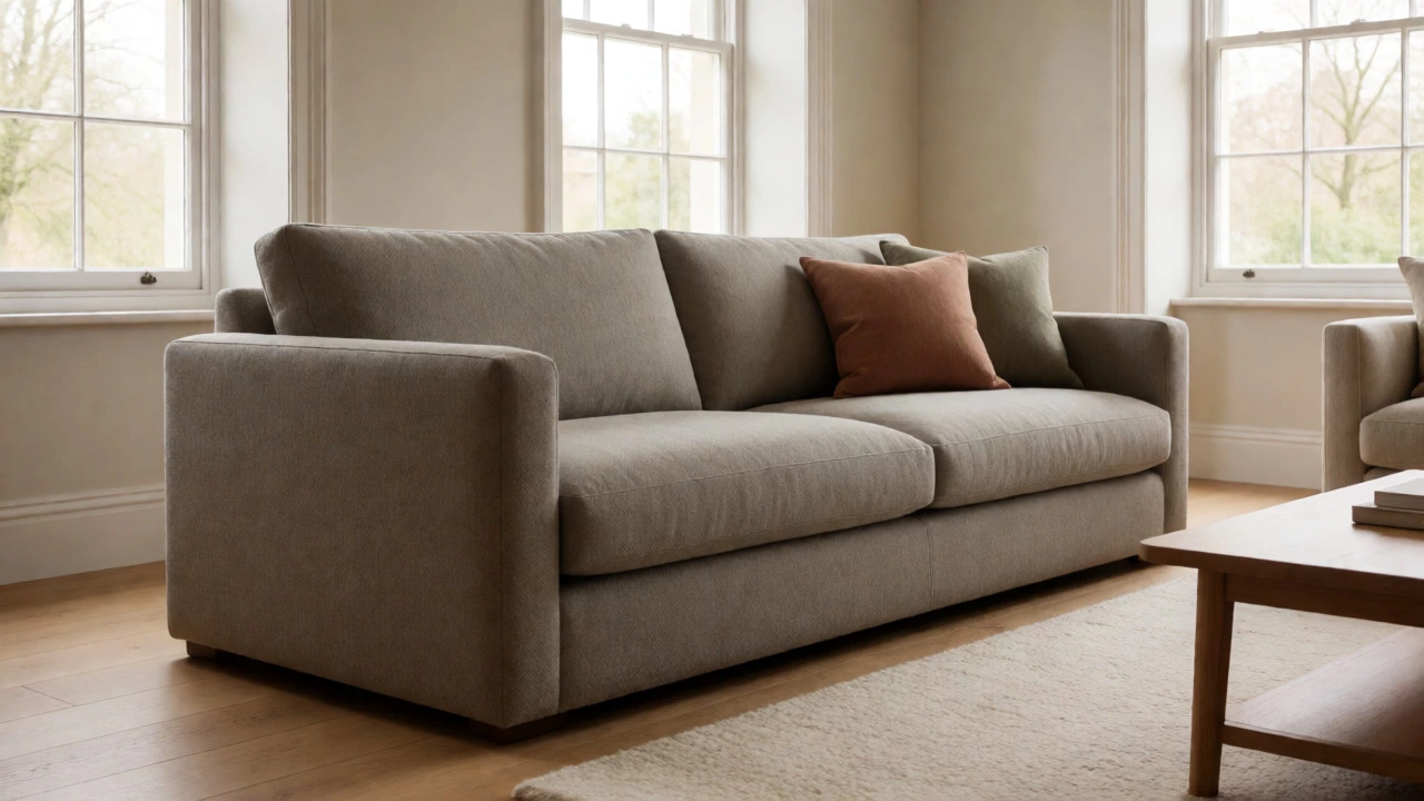
Warm light enhances beige undertones, making grays look softer and more inviting.
3. Find Your Perfect Match
Recommendation
Loading...
Watch Out:
You’re standing in the furniture showroom, staring at a wall of sofas. There’s the bold emerald green that screams personality, the dusty pink that’s trending on Instagram, and then there are the beige, gray, and navy options that look... well, safe. You want something you won’t hate in two years. You want a couch that works with your current rug, your future curtains, and whatever random art piece you pick up at a flea market next month. The truth is, no single color magically matches every possible object under the sun. But some colors come dangerously close.
If you’re looking for the safest bet in interior design, you’re looking for neutral tones. Specifically, warm neutrals like taupe, greige (a mix of gray and beige), and soft charcoal tend to be the most adaptable. Why? Because they lack strong chromatic intensity. They don’t fight with other colors; they support them. A bright yellow cushion looks vibrant against a gray sofa but might clash horribly with a teal one. A gray sofa just lets the yellow shine. Let’s break down exactly which shades work best and how to make them fit your specific space.
Why Neutrals Are the Secret Weapon of Versatile Furniture
Think of your sofa as the anchor of your living room. If the anchor is too heavy or oddly shaped, it drags the whole ship off course. In color theory, neutral colors are considered "achromatic" or low-saturation hues. This means they have minimal impact on the surrounding environment’s color harmony. When you choose a neutral sofa is a piece of furniture upholstered in colors such as white, black, gray, beige, brown, or cream, designed to complement rather than dominate a room's palette, you are essentially creating a blank canvas. This allows you to change the mood of the room simply by swapping out throw pillows, throws, or rugs without having to replace the entire seating arrangement.
This flexibility is crucial because our tastes change. Maybe you love bohemian vibes today, but next year you might lean into minimalist Scandinavian style. A neutral couch transitions between these styles seamlessly. A patterned or brightly colored couch locks you into a specific aesthetic. If you buy a floral print sofa, you’re committed to that look until you can afford to reupholster or replace it. Neutral gives you freedom.
The Top Contenders: Gray, Beige, Taupe, and Navy
Not all neutrals are created equal. Some grays can feel cold and sterile if your room has warm lighting. Some beiges can look dated if they’re too yellow. Here is a breakdown of the top contenders for the title of "most versatile," along with their strengths and potential pitfalls.
| Color | Best For | Potential Pitfall | Maintenance Level |
|---|---|---|---|
| Warm Gray / Greige | Modern, transitional, and industrial spaces. Works with both cool and warm accents. | Can look muddy if paired with poor lighting or conflicting undertones. | Moderate. Hides dust better than light colors but shows lint. |
| Taupe / Warm Beige | Traditional, rustic, and cozy interiors. Pairs beautifully with wood tones. | Can appear "builder grade" or cheap if the fabric texture is flat. | High. Shows stains easily; requires performance fabrics. |
| Navy Blue | Adding depth without brightness. Acts as a dark neutral in many palettes. | Can make small rooms feel smaller if not balanced with light walls. | Low. Hides shadows and minor spills effectively. |
| Charcoal / Black | Sleek, contemporary, and high-contrast designs. | Absorbs heat; can show pet hair and dust particles clearly. | Moderate. High visibility of debris. |
| Cream / Off-White | Bright, airy spaces and coastal themes. | Extremely prone to staining. Not ideal for homes with kids or pets. | Very High. Requires frequent cleaning. |
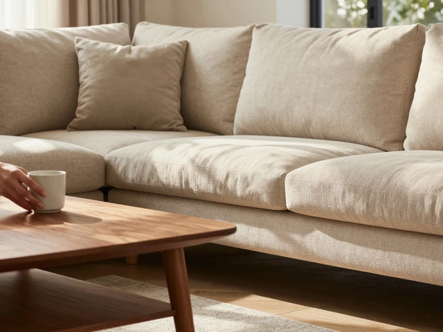
Let’s talk about Greige a color that combines gray and beige, offering a warm yet modern tone that adapts to various lighting conditions and decor styles. This is currently the darling of interior designers for good reason. Pure gray can sometimes feel corporate or cold, especially in New Zealand winters where natural light is scarce. Adding a touch of brown warmth to the gray makes it inviting. It pairs effortlessly with oak floors, white walls, and even bold accent chairs in mustard or terracotta. If you are torn between a modern look and a cozy feel, greige is often the perfect compromise.
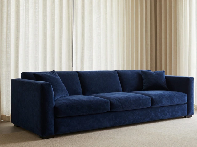
On the other end of the spectrum is Navy Blue a deep blue shade that functions as a neutral in interior design due to its ability to ground a space while adding subtle color depth. Many people hesitate to buy a colored sofa, fearing it will limit their choices. However, navy is widely accepted as a "dark neutral." It provides the same grounding effect as black or dark brown but adds a layer of sophistication and calm. It goes with almost everything-whites, creams, golds, silvers, and even other blues. The only time navy struggles is in very small, dimly lit rooms where it might swallow the space. But if you have decent window light, it’s a stunning, practical choice.
How Lighting Changes Your Perception of Color
You might have fallen in love with a specific shade of gray in the store, only to bring it home and realize it looks completely different. This isn’t bad luck; it’s physics. Light sources have color temperatures measured in Kelvins. Incandescent bulbs emit warm, yellowish light (around 2700K), while LED daylight bulbs emit cool, bluish light (5000K+). Your sofa’s fabric interacts with this light.
A cool gray sofa under warm yellow light might take on a greenish tint. A warm beige sofa under cool daylight might look stark white. Before you commit to a purchase, ask the retailer for fabric swatches. Take them home. Place them on your actual floor, near your actual windows. Look at them in the morning, at noon, and under your evening lamps. Do this for three days. If the color shifts in a way that bothers you, walk away. No amount of styling can fix a fundamental mismatch between fabric undertone and room lighting.
Material Matters More Than You Think
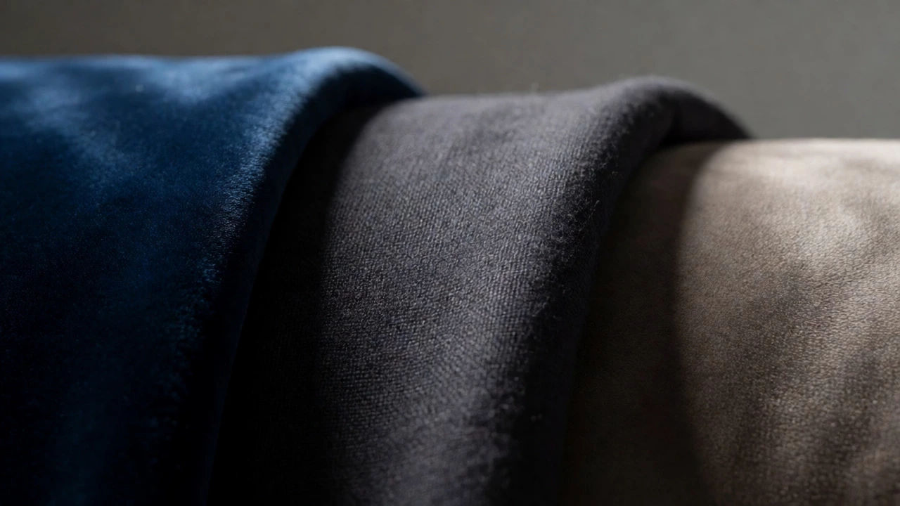
Color doesn’t exist in a vacuum. Texture changes how we perceive color. A velvet navy sofa reflects light differently than a linen navy sofa. Velvet absorbs light, making the color appear deeper and richer. Linen scatters light, making the color appear softer and more muted. If you want your couch to blend into the background, choose matte fabrics like cotton, linen, or microfiber. These materials diffuse light, reducing visual noise and helping the sofa recede visually.
If you want the sofa to be a focal point but still remain versatile, consider a textured weave in a neutral color. A chunky knit or a tight herringbone pattern in charcoal adds interest without introducing competing colors. This technique is particularly useful in monochromatic rooms where everything is one color family. The texture prevents the space from feeling flat or boring.
For households with children or pets, material durability is tied to color perception. Darker neutrals like charcoal or espresso brown hide stains better than lighter ones. However, they also highlight pet hair. If you have a shedding dog, a mid-tone gray or a multi-tonal tweed fabric is often smarter than solid black or solid white. The varied fibers camouflage the fur, keeping the sofa looking cleaner between vacuum sessions.
Styling Tips to Maximize Versatility
Once you’ve chosen your neutral couch, how do you keep it fresh? The key is contrast. A beige sofa in a beige room with beige walls can look like a dentist’s waiting room. You need layers.
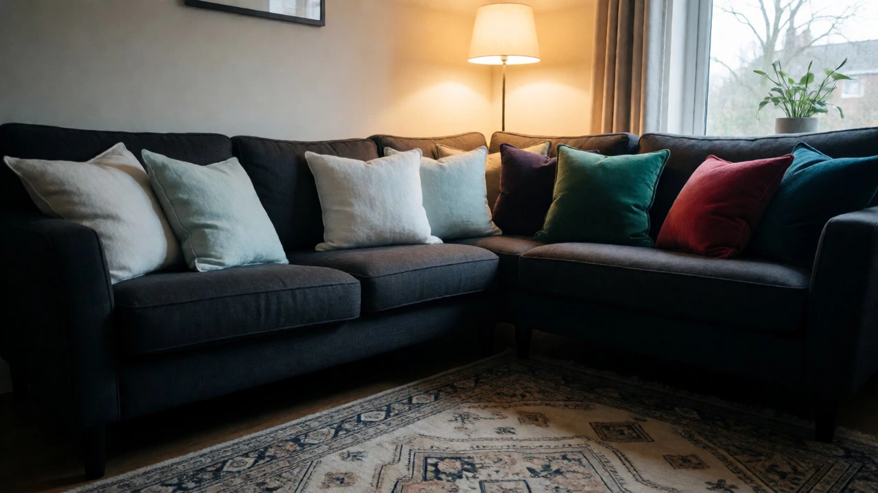
- Add Depth with Textiles: Use throw pillows in varying textures and patterns. Mix solids with stripes or geometric prints. Keep the base color of the pillows complementary to the sofa. If your sofa is warm taupe, use pillows in rust, olive, or cream. Avoid matching the pillow color exactly to the sofa unless you want a very minimalist look.
- Use Rugs to Anchor: A rug defines the zone. If your sofa is light, a darker rug grounds it. If your sofa is dark, a lighter rug lifts it. Ensure the rug ties together the colors of the sofa and other elements in the room.
- Rotate Accents Seasonally: One of the biggest advantages of a neutral sofa is the ability to swap accessories. In summer, use light linens and pastel cushions. In winter, switch to heavier velvets and jewel tones. Your core investment remains unchanged, but the vibe transforms.
Consider the flow of traffic and sightlines. Where does the eye land first when someone enters the room? If the back of the sofa faces the entrance, ensure the upholstery looks good from behind. Sometimes, manufacturers skimp on the back detailing. A neutral color helps here because imperfections are less noticeable than on a patterned fabric.
Common Mistakes to Avoid
The biggest mistake people make is ignoring the undertones of their existing fixed elements. Your flooring, cabinets, and fireplace surround are permanent fixtures. Your sofa should harmonize with them. If you have orange-toned oak floors, a cool gray sofa might clash, creating a jarring temperature difference. Instead, opt for a warm gray or a brown-based neutral. Conversely, if you have gray-stained concrete floors, a warm beige sofa might look dirty. Stick to cooler grays or whites.
Another pitfall is buying based solely on trends. While sage green or millennial pink were huge recently, they aren’t necessarily "go-with-everything" colors. They require careful curation. If you aren’t confident in your design skills, stick to the timeless neutrals. You can always add trend-driven colors through cheaper, easier-to-replace items like cushions and artwork.
Frequently Asked Questions
Is a white couch really worth it?
A white couch offers maximum versatility and brightness, making small spaces feel larger. However, it requires significant maintenance. Unless you use a high-performance, stain-resistant fabric like Crypton or Sunbrella, expect visible wear and tear quickly. It is best suited for adults-only homes or those willing to invest in professional cleaning.
What color hides dirt and stains best?
Mid-tone colors generally hide dirt best. Very light colors show stains immediately, while very dark colors show dust, lint, and pet hair. Charcoal, medium gray, and brown are excellent choices for hiding everyday messes. Patterned fabrics in neutral tones offer even better camouflage than solid colors.
Does a gray couch go with wood floors?
Yes, but pay attention to undertones. Cool grays pair well with gray-washed or whitewashed wood floors. Warm grays (greige) pair better with traditional honey or reddish-brown wood floors. Matching the temperature of the gray to the temperature of the wood ensures a cohesive look.
Can I have a colorful couch if I want versatility?
You can, but it limits your options. A navy or forest green couch acts as a neutral in many contexts. Bright reds, yellows, or purples are harder to match and may date quickly. If you love color, consider a neutral sofa with colorful armchairs instead. This allows you to introduce vibrancy without locking your main seating area into a specific scheme.
How do I test a sofa color before buying?
Always request physical swatches. View them in your home at different times of day under both natural and artificial light. Place the swatch against your walls, floor, and existing furniture. If possible, view the swatch from a distance to see how the color reads across the room, as colors often appear darker or lighter from afar.