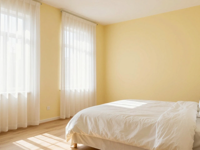
The Happiest Bedroom Color: Why Soft Yellow and Warm White Boost Mood
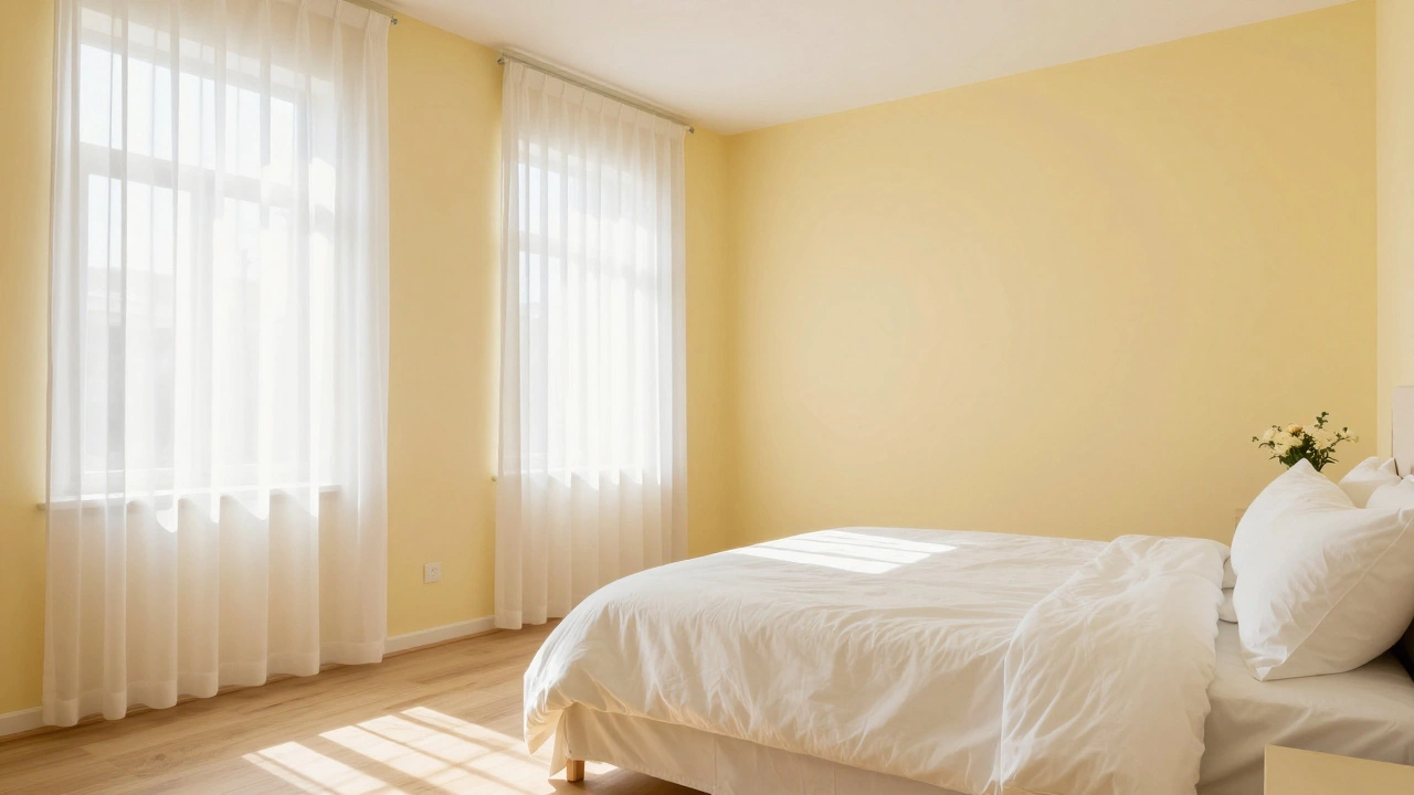
Bedroom Color & Lighting Simulator
Configure Your Room
Ever walked into a room and felt an instant lift in your spirits? That’s not magic. It’s color psychology at work. For most people, the happiest bedroom color isn’t a bold red or a stark black-it’s something softer, warmer, and more inviting. Research consistently points to light yellows and warm whites as the top contenders for creating a joyful, restful sanctuary.
But here’s the catch: "happy" looks different depending on your lighting, your window size, and even where you live. A sunny yellow that works in Auckland might feel overwhelming in a north-facing London flat. Let’s break down which shades actually boost your mood without keeping you awake all night.
The Science Behind Happy Colors
Color affects us because it interacts with our circadian rhythms and emotional centers. Bright, warm tones mimic sunlight, triggering serotonin release-the brain’s "feel-good" chemical. Cool tones like blue and green lower heart rates, promoting calm. But when we talk about *happiness* specifically, we’re looking for energy mixed with comfort.
Light Yellow is widely regarded as the happiest color. Studies from environmental psychology suggest that rooms painted in pale yellows are perceived as brighter and more cheerful than neutral grays or blues. However, saturation matters. A neon yellow wall will cause eye strain and anxiety. A buttery, pale lemon shade feels like sunshine without the glare.
Consider this: In a study published by the University of Arizona, participants rated rooms with soft yellow accents as significantly more uplifting than those with primary colors or dark neutrals. The key was subtlety. You don’t need to paint every surface; strategic use creates the effect.
Top Contenders for the Happiest Bedroom Palette
| Color | Mood Effect | Best For | Pitfall to Avoid |
|---|---|---|---|
| Soft Yellow | Uplifting, energetic yet gentle | Sunny mornings, small spaces | Avoid bright/orange-leaning yellows |
| Warm White | Clean, airy, peaceful happiness | Minimalist styles, low-light rooms | Cool whites can feel sterile | d>
| Pale Peach | Comforting, nurturing warmth | Cozy retreats, master bedrooms | Can look pink if undertones are wrong |
| Mint Green | Fresh, balanced, lightly energizing | Spring-like vibes, cluttered rooms | Too much green can feel clinical |
Why Lighting Changes Everything
You can pick the perfect happy color, but if your lighting is off, the room will feel dull or harsh. Natural light shifts throughout the day, and artificial light has its own temperature measured in Kelvins (K).
- Natural Light: South-facing rooms (in the Northern Hemisphere) get cooler, bluer light. North-facing rooms get softer, indirect light. Adjust your paint choice accordingly. In a dim north-facing room, go warmer-peach or golden yellow-to compensate.
- Artificial Light: Use bulbs between 2700K and 3000K for a warm, inviting glow. Higher Kelvin values (4000K+) create a hospital-like sterility that kills the "happy" vibe instantly.
- Lamp Placement: Layer your lighting. Combine overhead lights with floor lamps and bedside sconces. Shadows add depth and coziness, making the color feel richer and more dynamic.
In Auckland, where daylight hours vary less dramatically than in northern latitudes, consistent natural light means you can safely choose lighter shades without worrying about extreme seasonal darkness. But always test samples on the wall first. Watch how they change from morning to evening.
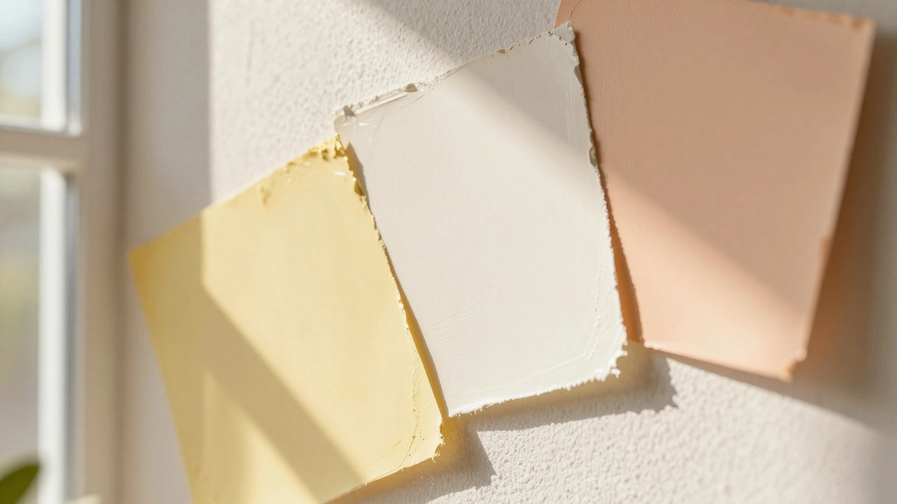
How to Test Colors Before Committing
Never buy a gallon based on a tiny swatch in the store. Here’s a foolproof method:
- Buy Sample Pots: Get small quantities of 2-3 similar shades. Look for ones labeled "eggshell" or "satin" finish-they reflect light better than flat paints.
- Paint Large Swatches: Apply each color to a 1x1 foot square on different walls. One near a window, one in a corner, one opposite a door.
- Observe Over 3 Days: Check the colors at sunrise, noon, sunset, and under artificial light at night. Note which one makes you smile when you walk in.
- Live With It: Sleep in the room with the sample up. Does it feel calming before bed? Energizing upon waking?
This step saves you from costly mistakes. I’ve seen too many homeowners regret painting their entire bedroom a vibrant orange because it looked great next to beige trim in the hardware aisle.
Accent Walls vs. Full Rooms
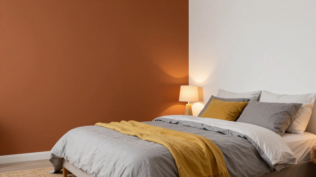
If you love a bold happy color but fear overwhelming the space, try an accent wall. Paint just the headboard wall in a deeper yellow or terracotta. Keep the other three walls in a crisp warm white. This draws the eye, adds personality, and maintains balance.
Alternatively, use textiles. Throw pillows, duvet covers, and rugs in happy hues can inject joy without permanent commitment. Swap them out with seasons or moods. A mustard yellow pillow against gray bedding pops beautifully and lifts the room’s energy.
Common Mistakes to Avoid
Even well-intentioned choices can backfire. Watch out for these traps:
- Ignoring Undertones: A "white" paint can have blue, gray, or yellow undertones. Blue undertones clash with warm wood floors. Always check the undertone label.
- Over-Saturating: Too much color causes visual fatigue. Stick to 60% neutral, 30% secondary, 10% accent rule.
- Skipping Texture: Flat paint reflects light differently than textured walls. If your walls have imperfections, use a smoother finish to keep the color true.
- Forgetting Furniture: Your existing furniture influences the final look. A dark oak dresser absorbs light, making nearby walls appear darker. Account for this when choosing brightness levels.
Personalizing Your Happy Space
Happiness is subjective. While data favors yellow, your personal associations matter. Did you grow up in a house with mint green kitchens? That might evoke nostalgia and joy for you. Bring in elements that resonate personally-photos, art, heirlooms-in colors that make *you* smile.
Create a vision board. Pin images of bedrooms that feel right to you. Notice recurring colors. Are they mostly earth tones? Pastels? Bold primaries? Your instinct often knows what research confirms.
FAQ
Is yellow really the happiest color for a bedroom?
Yes, light and soft yellows are scientifically linked to increased serotonin and positive mood. However, avoid bright or orange-leaning yellows, which can cause stress. Opt for pale, buttery shades for a gentle uplift.
What if my bedroom gets little natural light?
Choose warmer tones like peach, cream, or golden yellow to counteract cool, dim light. Pair with warm-white LED bulbs (2700K-3000K) and mirrors to bounce available light around the room.
Can I use bold colors like red or orange for happiness?
Bold colors increase energy but also raise heart rates and can disrupt sleep. Use them sparingly as accents-pillows, art, or a single wall-rather than full-room coverage for a bedroom setting.
How do I know if a white paint has warm or cool undertones?
Hold the swatch next to a pure white piece of paper. If it looks slightly yellow or creamy, it’s warm. If it looks bluish or grayish, it’s cool. Warm whites pair best with wood tones and cozy textiles.
Does ceiling color affect the mood of the bedroom?
Yes. Painting ceilings a very light tint of your wall color (or pure white) keeps the room feeling open and airy. Dark ceilings can make a space feel smaller and heavier, reducing the "happy" effect.