How to Make a Bookshelf Look Classy: Simple Tips for a Sophisticated Display
Bookshelf Spacing Calculator
Calculate your ideal bookshelf arrangement using the article's 60/40 rule: 60% books, 40% empty space for a sophisticated look.
How it works: Enter your shelf width and we'll show the optimal book arrangement.
Recommended Arrangement
Book Space:
The ideal space for your books
Empty Space:
Visual relief for sophisticated arrangement
Pro Tip: Use the 60/40 rule from the article. Place books in clusters of 3-5 with space between groups. Add 1-3 decorative objects for balance.
Everyone has a bookshelf. But not everyone has a bookshelf that looks like it belongs in a magazine. The difference isn’t about how much you spent or how many books you own. It’s about how you arrange them, what you put beside them, and how you let light and space work for you. A classy bookshelf doesn’t scream luxury-it whispers it. And you don’t need a designer to pull it off.
Start with the basics: clean lines and clear space
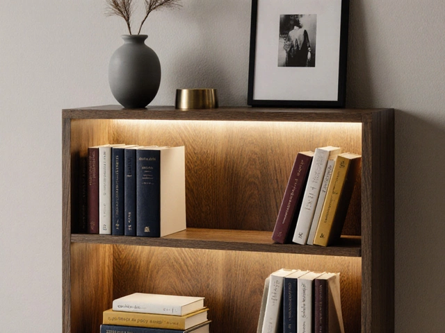
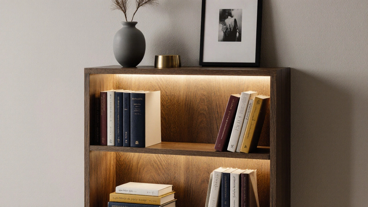
A cluttered bookshelf looks cheap. A well-curated one looks intentional. Before you even think about adding decor, clear everything off. Wipe down the shelves. Check for dust in the corners. Then, step back and look at the shape of the shelf itself. Is it tall? Wide? Floating? Solid wood? The frame matters. A sleek, minimalist bookcase in walnut or oak instantly reads as high-end. Even a basic flat-pack unit can look expensive if you treat it like a display case, not a storage bin.
Leave breathing room. Don’t pack books edge-to-edge. Aim for 60% books, 40% empty space. That gap isn’t wasted space-it’s visual relief. It lets the eye rest. It makes the objects on the shelf feel intentional, not accidental.
Group books by color, not size
Sorting books by height? That’s practical, not stylish. Sorting by color? That’s design. A shelf with a gradient of navy, mustard, cream, and burgundy books creates rhythm. It turns reading material into art. You don’t need to buy new books. Use book covers you already own. Flip some backward so the spine is hidden-this reveals the page edges, which often come in neutral tones like cream or gray. These act as visual anchors.
Try this: pick three dominant colors from your room-say, charcoal, sage, and gold-and arrange books in those tones. Then, place one or two bright books as accents. It’s like painting with paper. The effect is subtle but powerful.
Layer in objects with purpose
A classy bookshelf isn’t just books. It’s a curated gallery. But don’t just throw on a vase and a candle and call it done. Choose objects that feel like they belong.
- A small ceramic vase with a single stem-preferably something handmade or textured.
- A stack of three art books, spine out, with one leaning slightly forward.
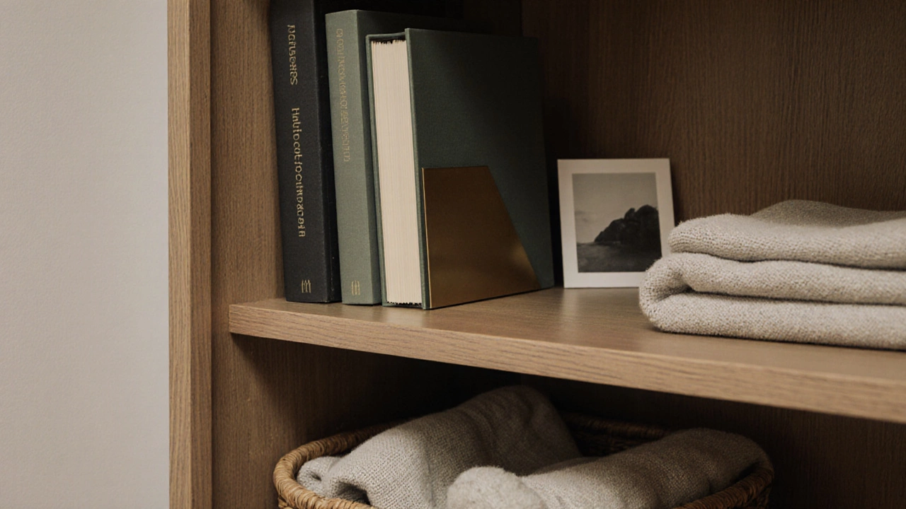
- A framed black-and-white photo, placed vertically between two taller books.
- A small brass bookend, not plastic.
- A tiny sculpture or stone from a trip you took-something with personal meaning.
Odd numbers work better than even. Three objects feel balanced. Five feel intentional. One feels bold. Seven feels cluttered. Keep it simple.
Height variation is key. Place taller items toward the back or on one end. Let smaller pieces sit in front. This creates depth. It stops the shelf from looking flat.
Lighting makes everything feel more expensive
Most bookshelves are lit by overhead lights or nothing at all. That’s a mistake. Soft, focused light turns a shelf into a statement.
Install a thin LED strip under the shelf. It casts a warm glow on the books below, creating a halo effect. Or use a small table lamp nearby that bounces light off the wall behind the shelf. Even a battery-powered puck light tucked behind a book can work. You don’t need hardwired fixtures. The goal is to make the shelf feel lit from within-not just illuminated from above.
Lighting doesn’t just show off your books. It makes the whole space feel calmer, more intentional. It’s the difference between a shelf and a moment.
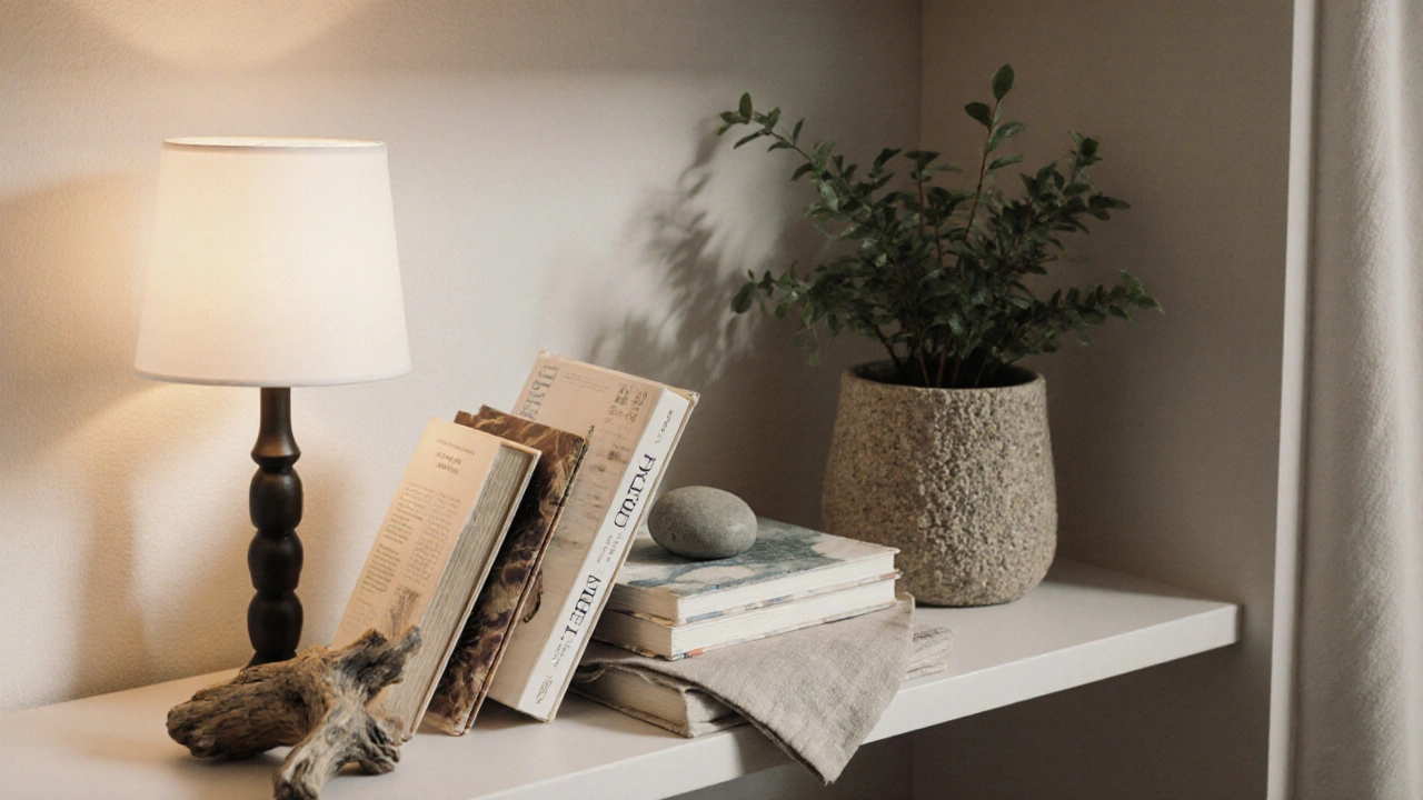
Use texture to add warmth
A wood shelf with only books looks sterile. Add texture, and it feels lived-in, not staged.
- A woven basket tucked under the shelf for blankets or magazines.
- A linen napkin folded neatly beside a stack of journals.
- A small ceramic bowl holding keys or loose change-something real, not decorative.
- A piece of driftwood or a smooth river stone.
Texture invites touch. It breaks up hard edges. It makes the space feel human. That’s what classy means-not perfect, but personal.
Keep it evolving
A classy bookshelf isn’t set and forget. It’s a living display. Rotate items every few months. Swap out a book for a new one you’ve just read. Change the vase. Move the photo. Let your shelf reflect your current mood, your latest interest, your newest inspiration.
Don’t wait for a perfect moment. Start now. Even if you only have five books. Even if your shelf is cheap. Style isn’t about budget. It’s about attention.
What not to do
Some mistakes instantly date a bookshelf:
- Plastic storage bins labeled with stickers-hide them under the shelf or in a cabinet.
- Too many figurines or collectibles-they turn the shelf into a museum of random stuff.
- Matching everything-perfect symmetry looks forced. Asymmetry feels natural.
- Using decorative items that don’t relate to your life-a fake cactus, a generic globe, a crystal you bought on impulse.
- Leaving dust. Seriously. Dust kills elegance.
Classy doesn’t mean expensive. It means thoughtful.
Real example: a 3-step refresh
Here’s how to do this in under an hour:
- Remove everything. Wipe the shelves.
- Sort your books by color-group blues, then neutrals, then warm tones. Flip some backward.
- Add three objects: a small plant, a framed photo, and a brass bookend. Turn on a lamp nearby.
Step back. That’s your new bookshelf. No new purchases. No renovation. Just a shift in how you see it.
Final thought: it’s not about the shelf
The bookshelf is just the container. What makes it classy is what you choose to put in it-and why. It’s the book you’re reading right now. The stone you picked up on your last walk. The photo of your grandmother. These aren’t decorations. They’re memories made visible.
A classy bookshelf doesn’t impress guests. It comforts you. Every time you walk past it, you see a little piece of your life, arranged with care. That’s the real luxury.
Can I make a cheap bookshelf look classy?
Yes. A cheap bookshelf can look expensive if you focus on arrangement, lighting, and curation. Paint it a neutral tone like charcoal or cream. Use book color grouping, add texture with woven baskets or ceramics, and include one or two meaningful objects. Lighting is the game-changer-add a small LED strip or lamp to create warmth.
How many books should I display on a classy shelf?
There’s no magic number, but aim for about 60% books and 40% open space. Too many books look cluttered. Too few look empty. The goal is balance-enough to show personality, but not so much that it overwhelms. Group books in clusters of three to five, with space between each group.
Should I use bookends?
Yes, but choose them carefully. Bookends aren’t just functional-they’re design elements. Avoid plastic or cartoonish styles. Opt for solid materials like brass, stone, or wood. A single pair of simple bookends can define the ends of a shelf and add weight to the look. If you don’t want them visible, hide them behind a stack of books.
What’s the best way to arrange art books?
Stack two or three art books flat, spine down, and lean one slightly forward. This creates a visual break in the vertical lines of books. Place them near the center or end of the shelf. Use them as a base for a small object like a sculpture or candle. Art books are heavy, so they anchor the display. Don’t stack them vertically-they look like a pile, not a display.
Do I need to match my bookshelf to my furniture?
No. A bookshelf doesn’t need to match your sofa or table. What matters is harmony in tone and mood. A dark wood shelf works with light walls. A white shelf looks modern against a dark rug. Focus on color balance and texture, not exact matches. Contrasts can be elegant-just make sure the materials feel intentional.